Woodmere Art Museum
Brand Identity + Motion
*/About/*
Woodmere Art Museum is an art museum in the Chestnut Hill neighborhood of Philadelphia, Pennsylvania, holding a collection of over 8,000 works of art focused on Philadelphia artists.
*/Mission/*
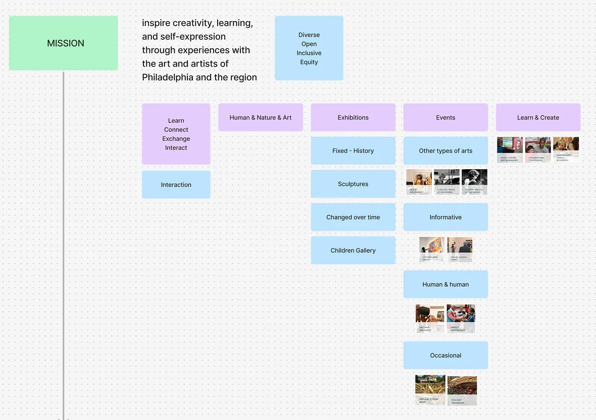
To inspire creativity, learning, and self-expression through experiences with the art and artists of Philadelphia and the region.
*/The New Identity/*
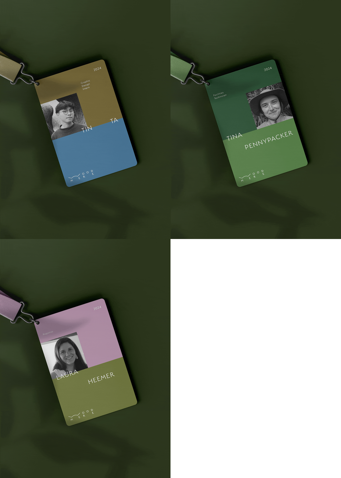
Where art meets nature, and nature meets us. Woodmere’s new identity is a tribute to openness—of space, of mind, and of community. I designed a system that is intentionally simple and casual, allowing it to live quietly alongside the museum’s vibrant collection and lush surroundings. This brand is for everyone: a transparent framework that celebrates the beauty of the arts without the ego of the institution.
Woodmere Art Museum is an art museum in the Chestnut Hill neighborhood of Philadelphia, Pennsylvania, holding a collection of over 8,000 works of art focused on Philadelphia artists.
*/Mission/*
To inspire creativity, learning, and self-expression through experiences with the art and artists of Philadelphia and the region.
*/The New Identity/*
Where art meets nature, and nature meets us. Woodmere’s new identity is a tribute to openness—of space, of mind, and of community. I designed a system that is intentionally simple and casual, allowing it to live quietly alongside the museum’s vibrant collection and lush surroundings. This brand is for everyone: a transparent framework that celebrates the beauty of the arts without the ego of the institution.

INSPO + EXPLORATION
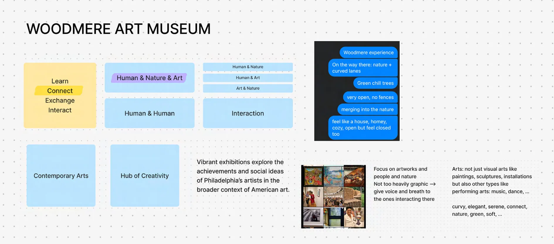
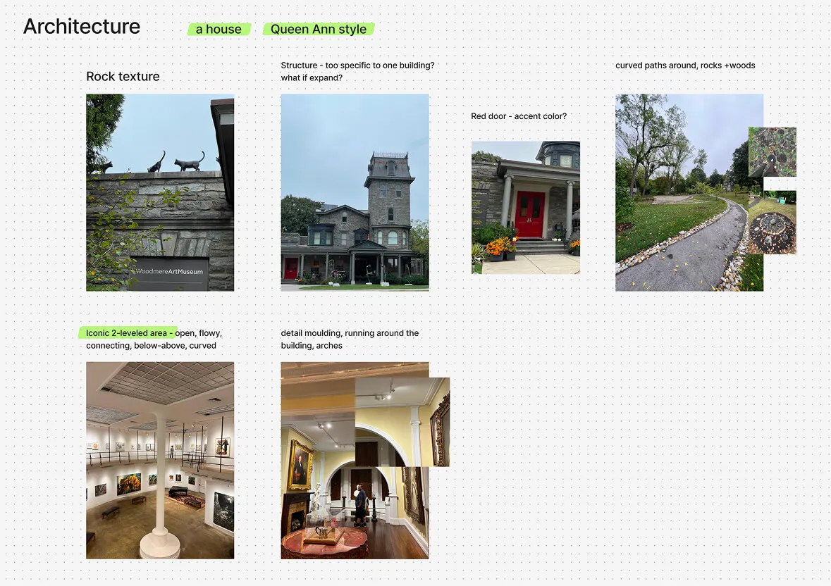
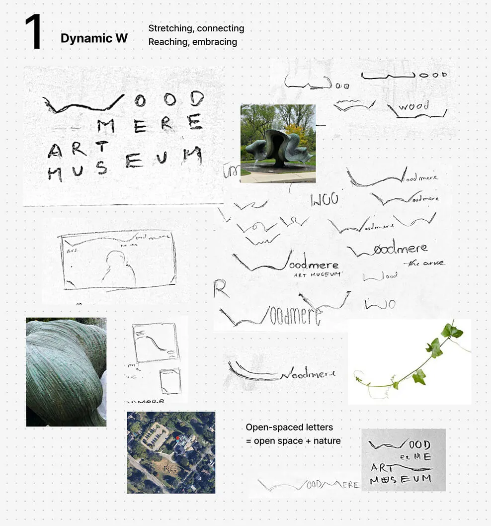
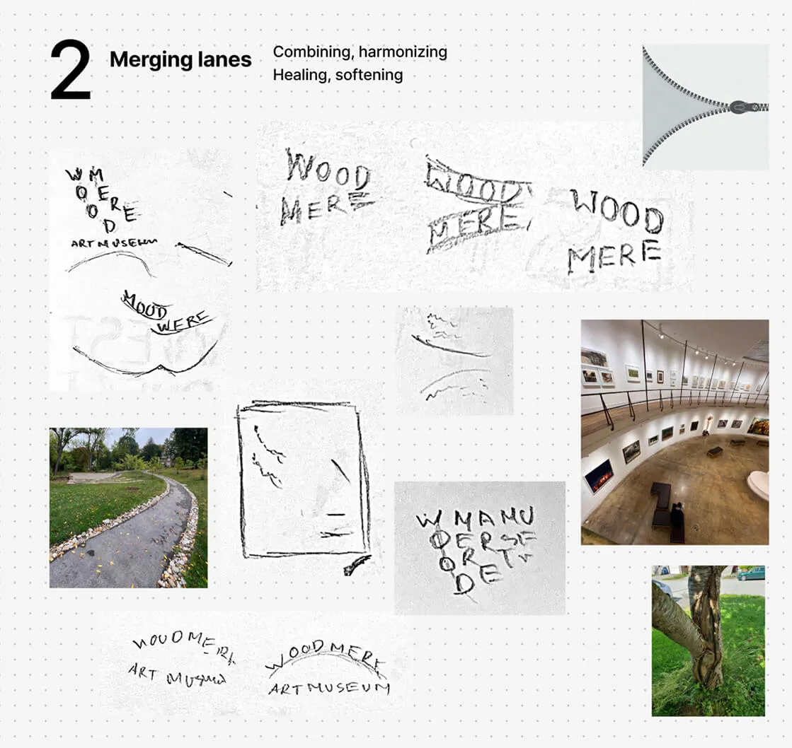
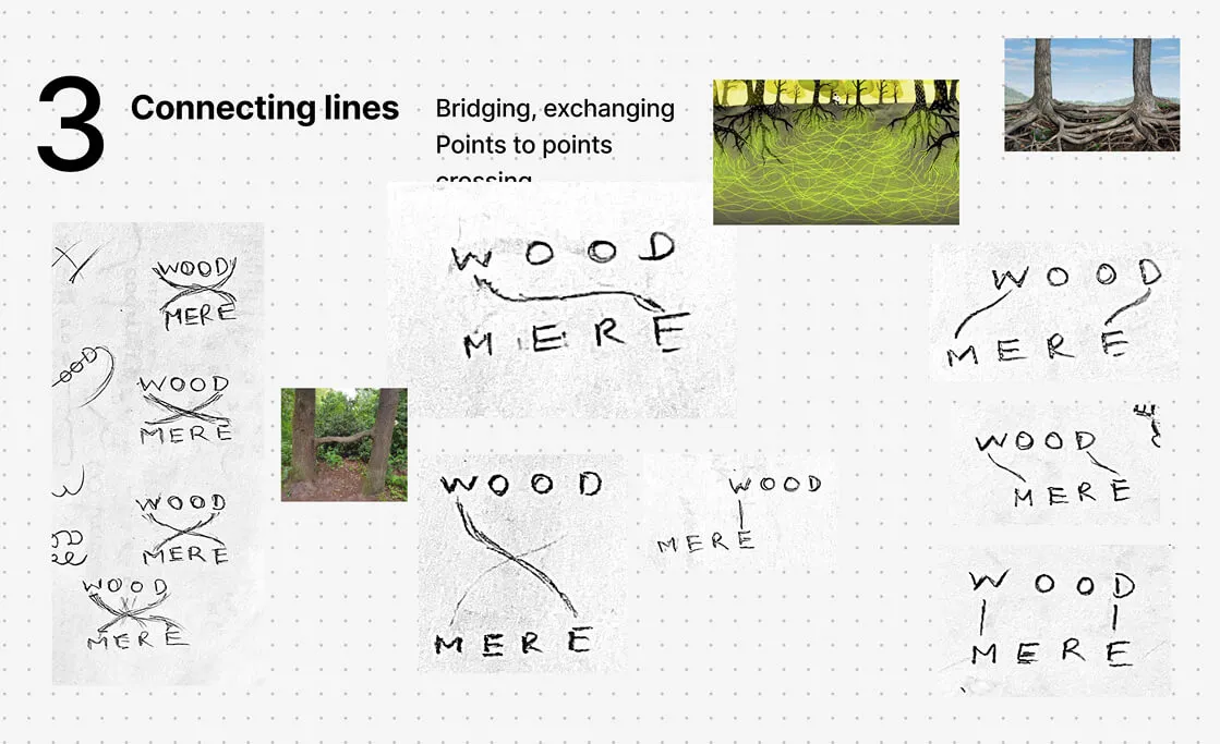
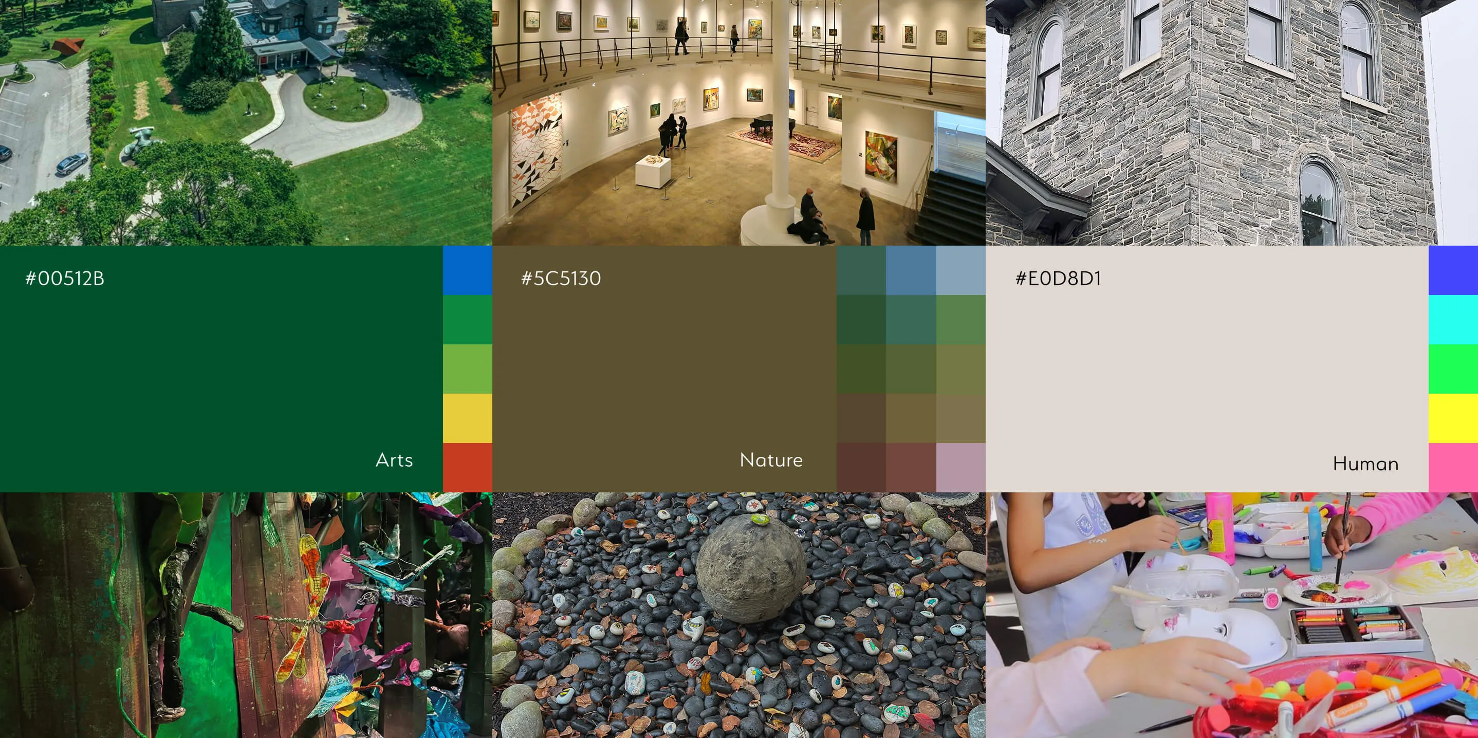
I began the project by visiting the museum in person, recording the landscape and experience on-site. Combining this with research on Woodmere’s programs, I mapped out three blending keywords: Human + Nature + Art. This synthesis created the image of a casual, community-open museum—not just a place for displaying arts, but a hub for people of all backgrounds to learn, play, and create while immersed in nature.
I began the project by visiting the museum in person, recording the landscape and experience on-site. Combining this with research on Woodmere’s programs, I mapped out three blending keywords: Human + Nature + Art. This synthesis created the image of a casual, community-open museum—not just a place for displaying arts, but a hub for people of all backgrounds to learn, play, and create while immersed in nature.
THE W MARK
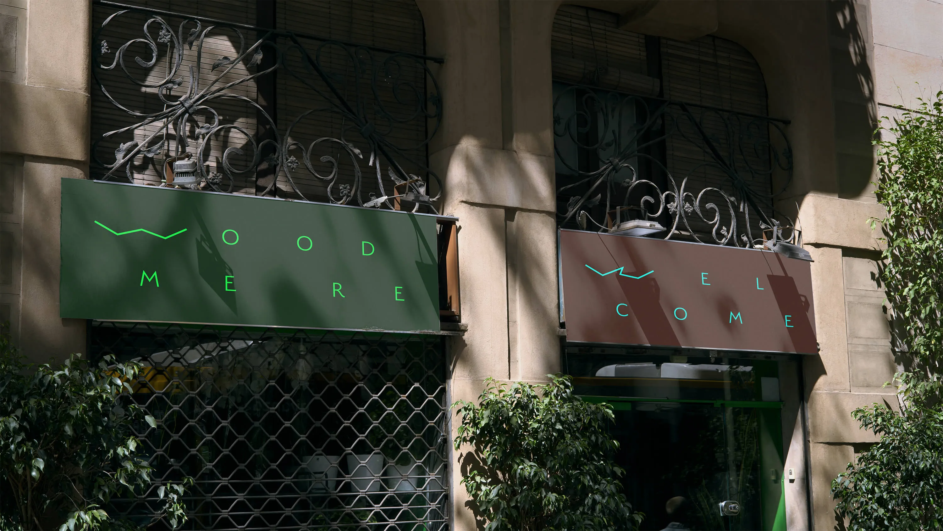
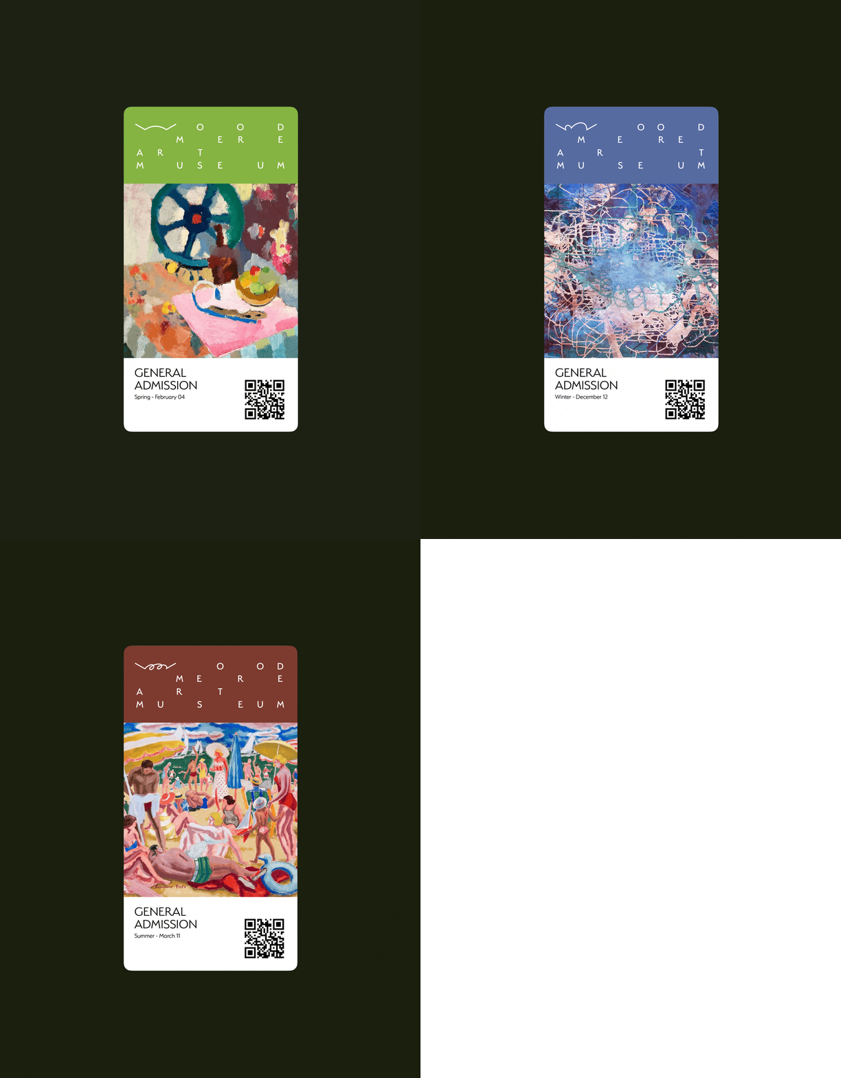
The "W" from the museum name is converted into a dynamic mark that adapts to seasons, events, topics, and themes. It acts as a symbol connecting two sides (Arts and Human) and everything in between (Nature and more).
The "W" from the museum name is converted into a dynamic mark that adapts to seasons, events, topics, and themes. It acts as a symbol connecting two sides (Arts and Human) and everything in between (Nature and more).
Non-Intrusive Visibility
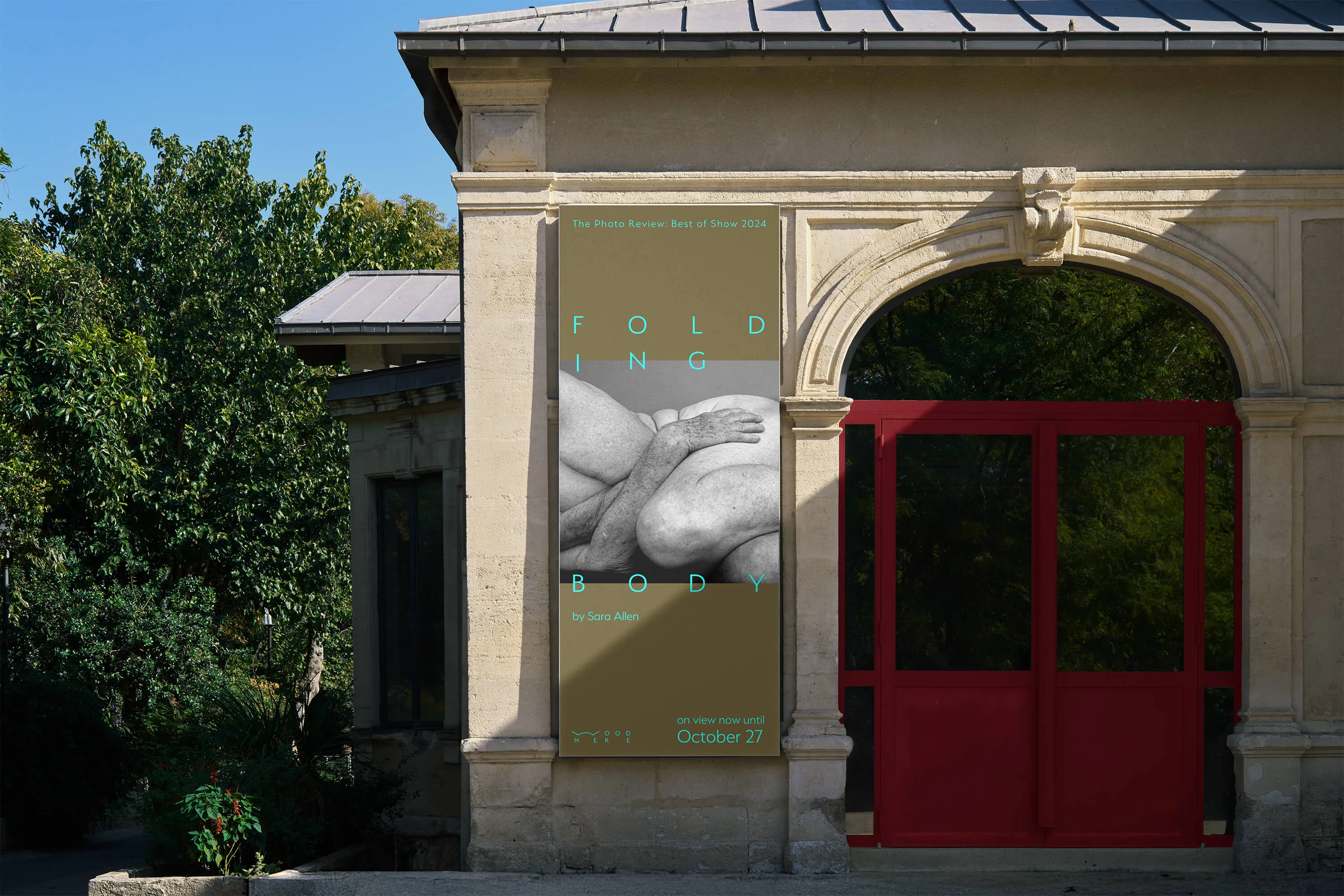
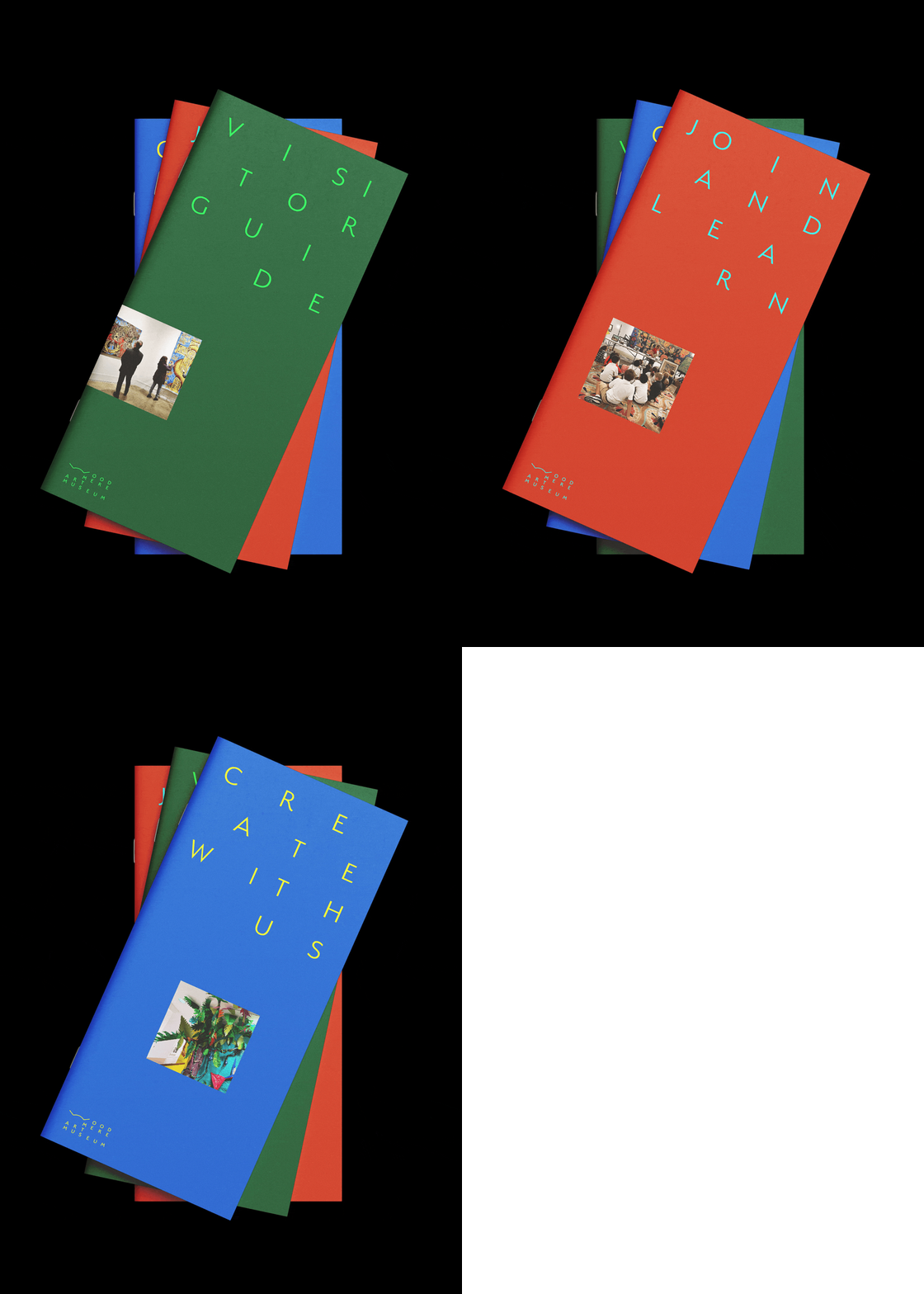
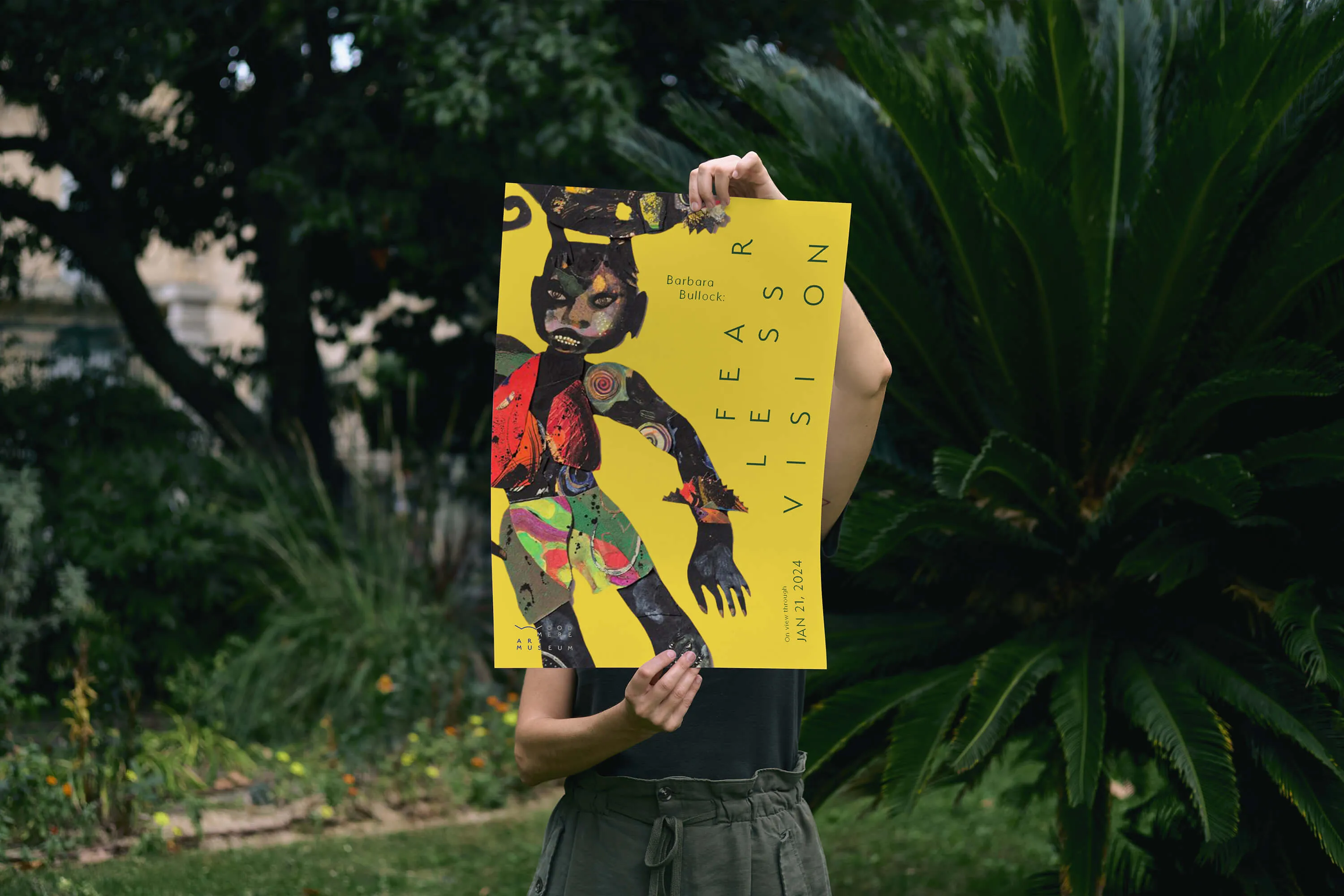
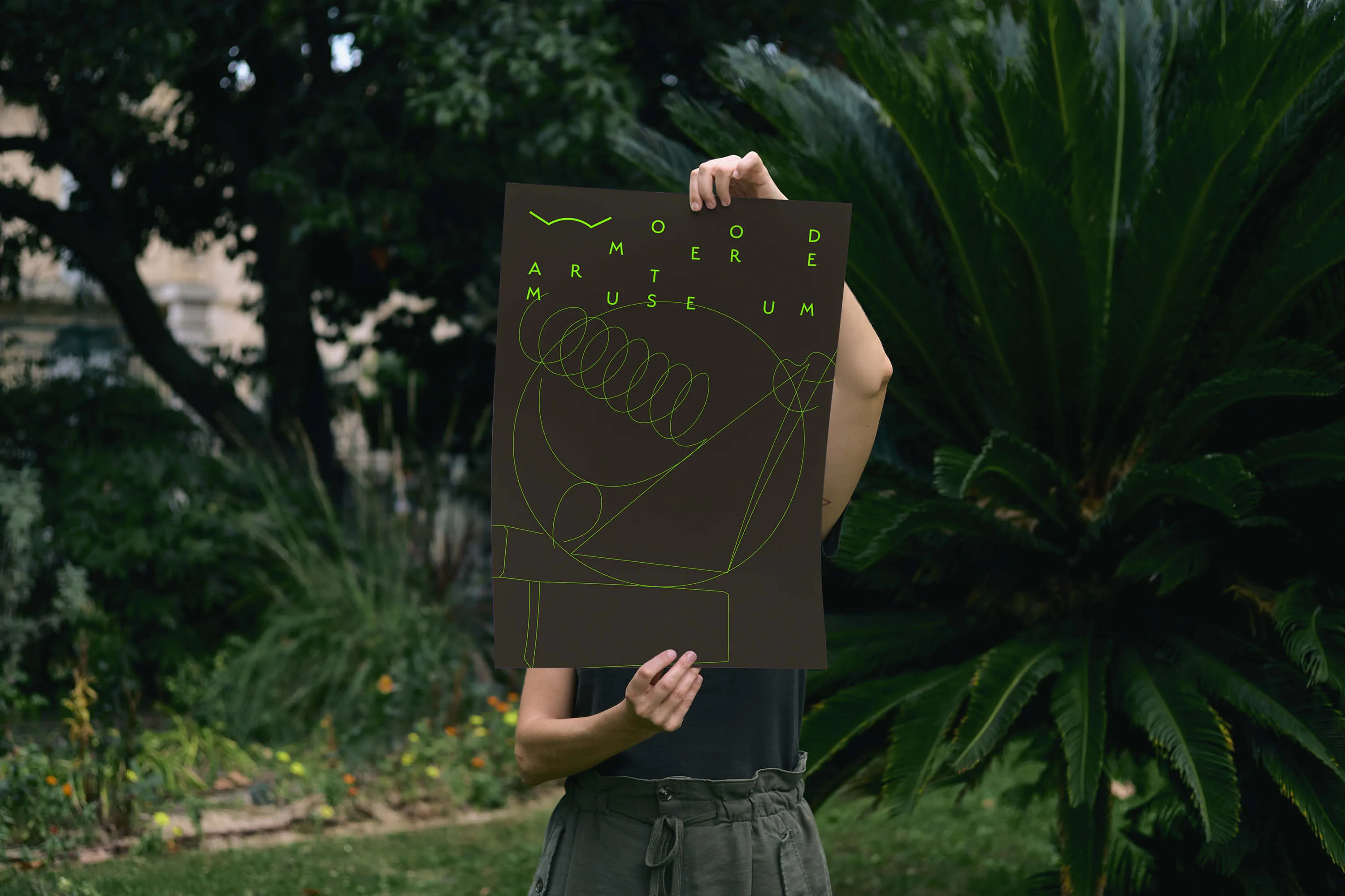
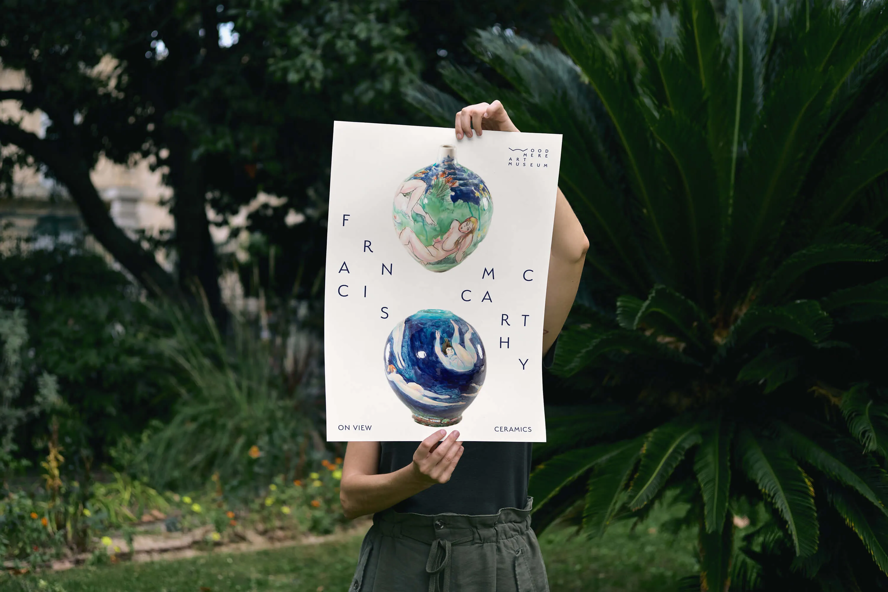
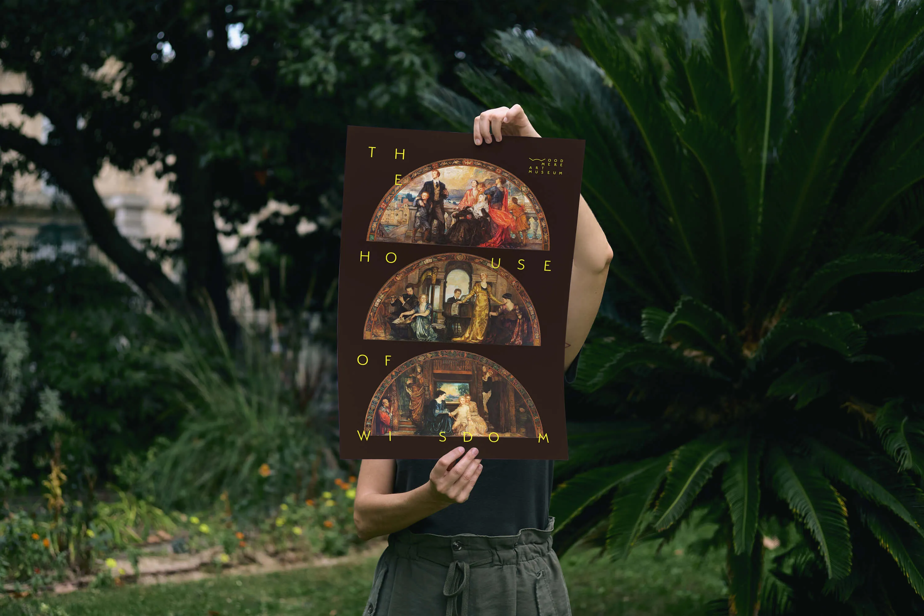
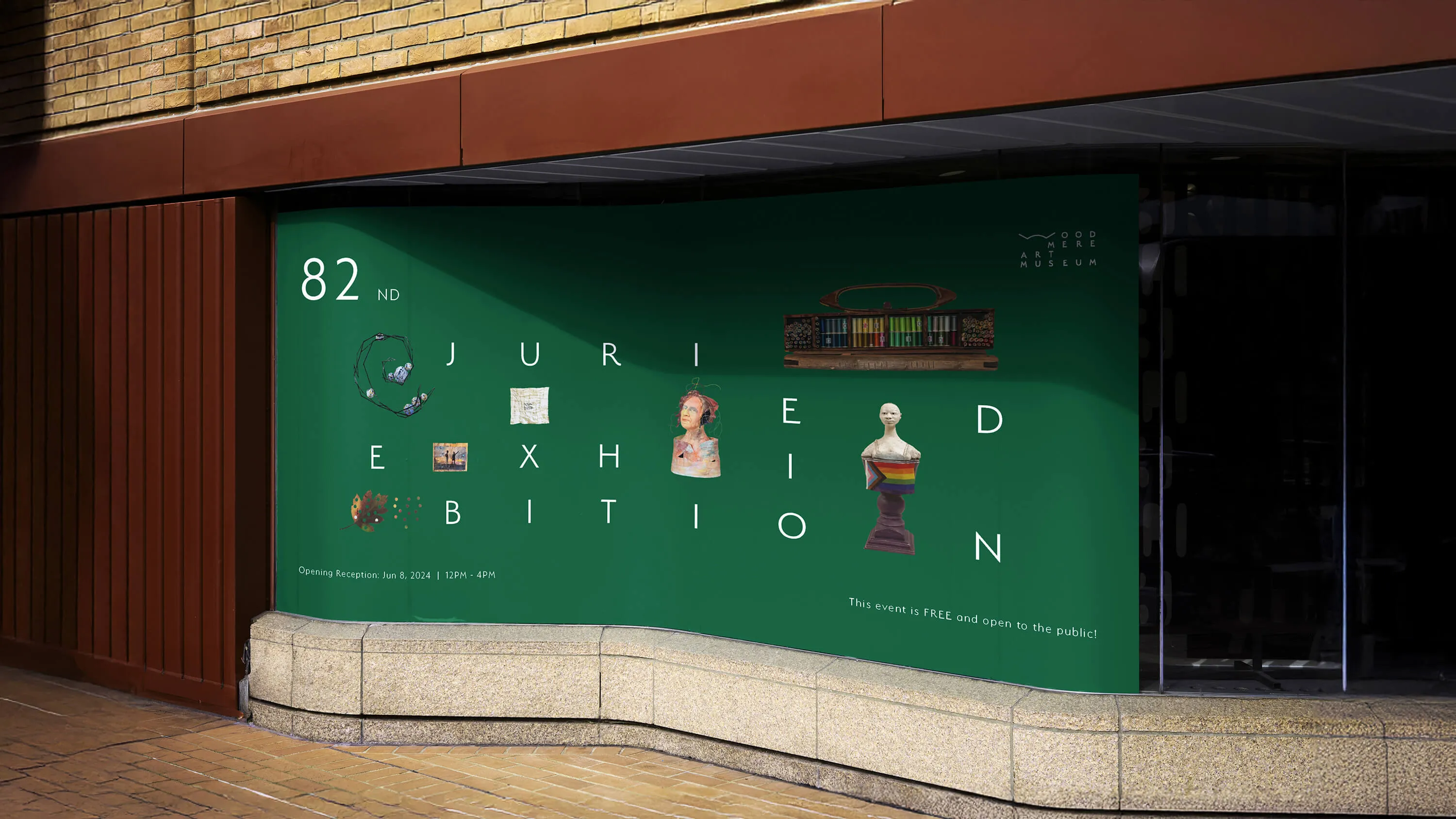
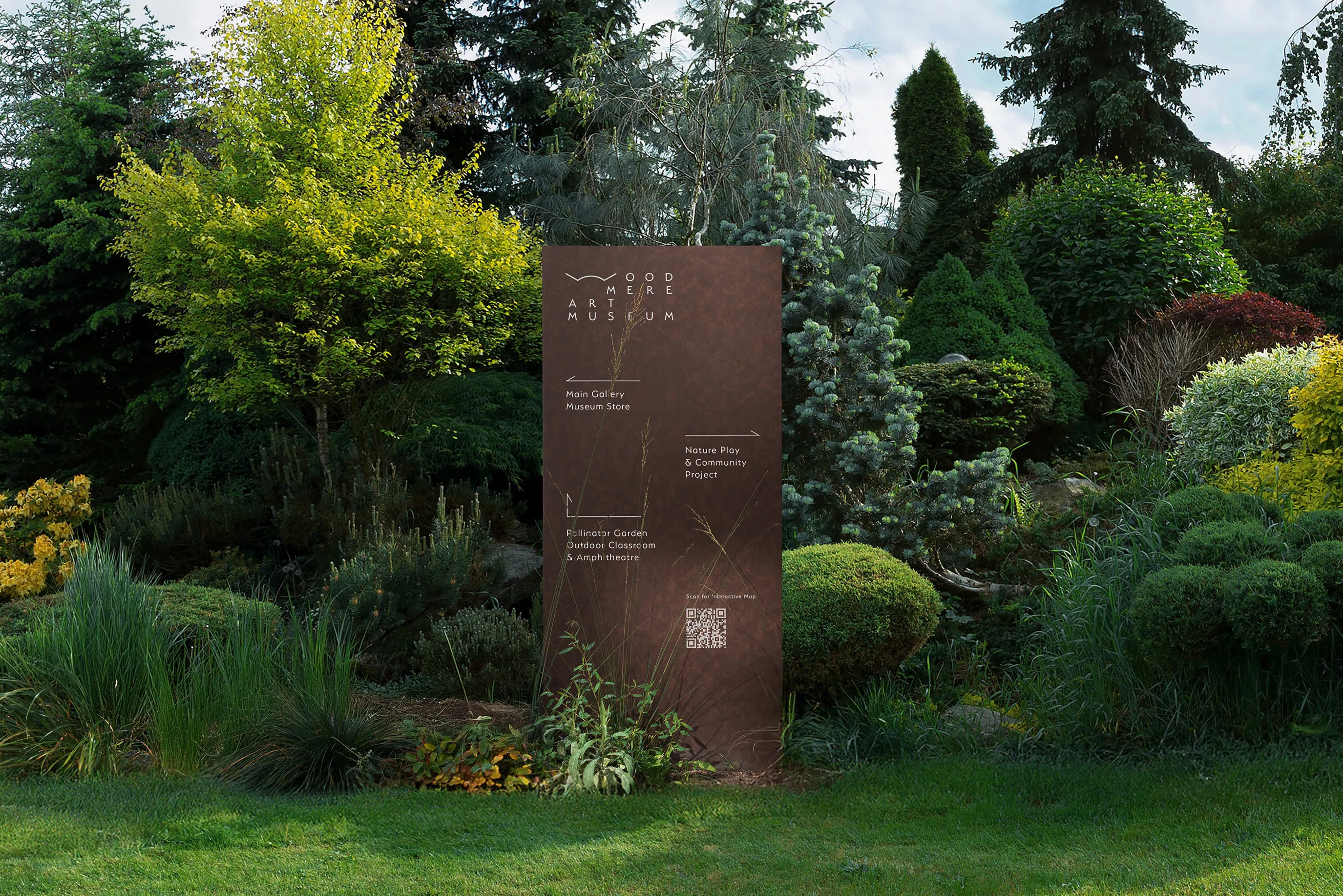
A unique grid treatment for the typography allows the identity to stand out while adapting flexibly around artworks, events, and programs without intruding on their visual presentation.
A unique grid treatment for the typography allows the identity to stand out while adapting flexibly around artworks, events, and programs without intruding on their visual presentation.
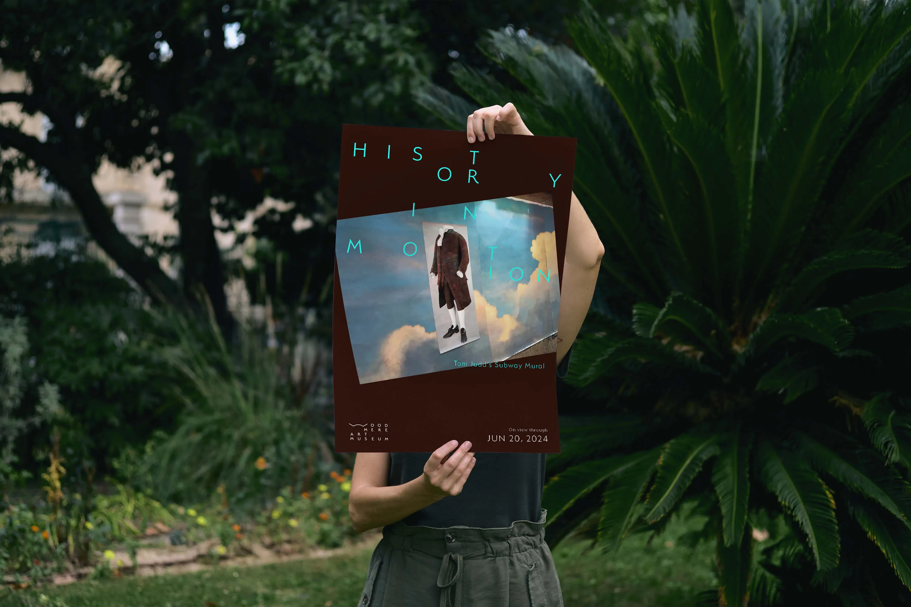
UNLIMITED TYPEFACES
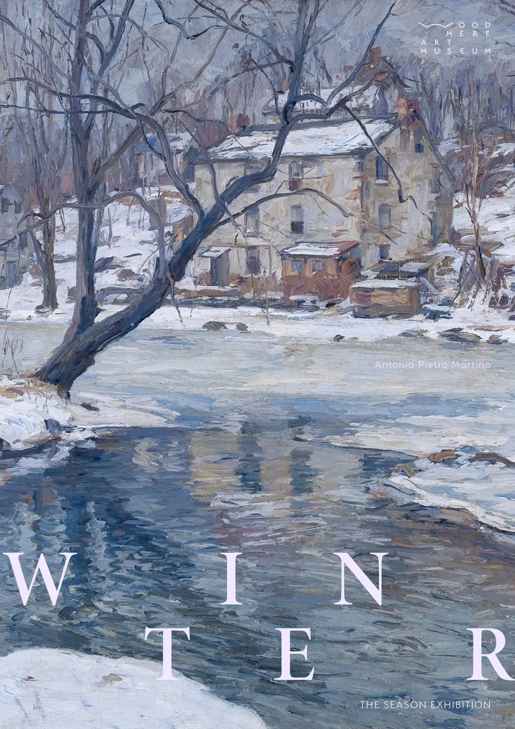
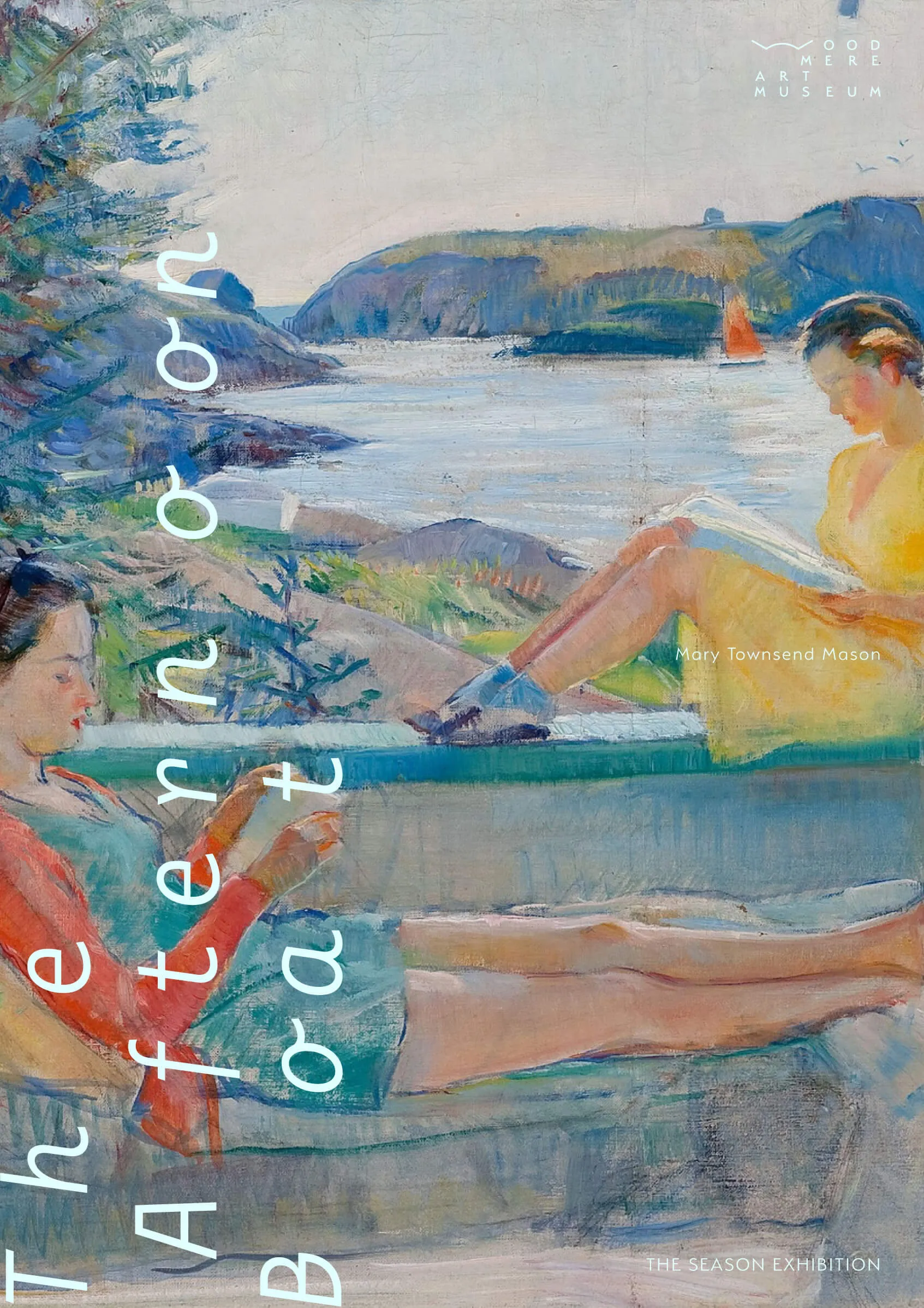
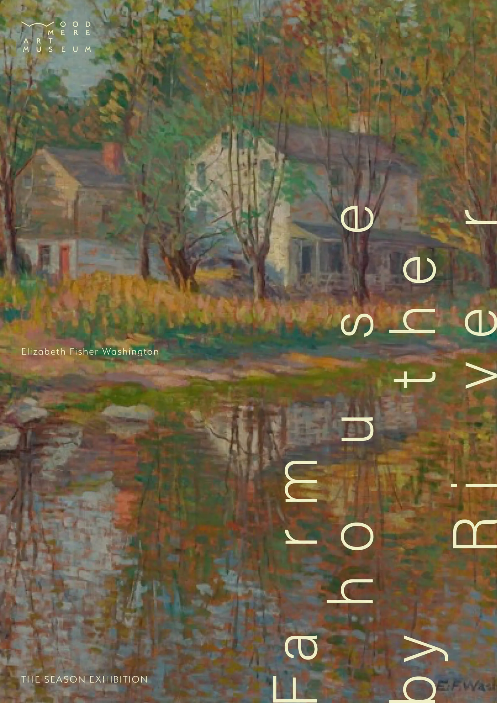
The grid system serves as the foundation for the typefaces to change (if needed) according to events, seasons, programs, artworks, and so on. This allows the system to expand in multiple directions, adapting to the growth of the institution.
The grid system serves as the foundation for the typefaces to change (if needed) according to events, seasons, programs, artworks, and so on. This allows the system to expand in multiple directions, adapting to the growth of the institution.

THE Straw Maze
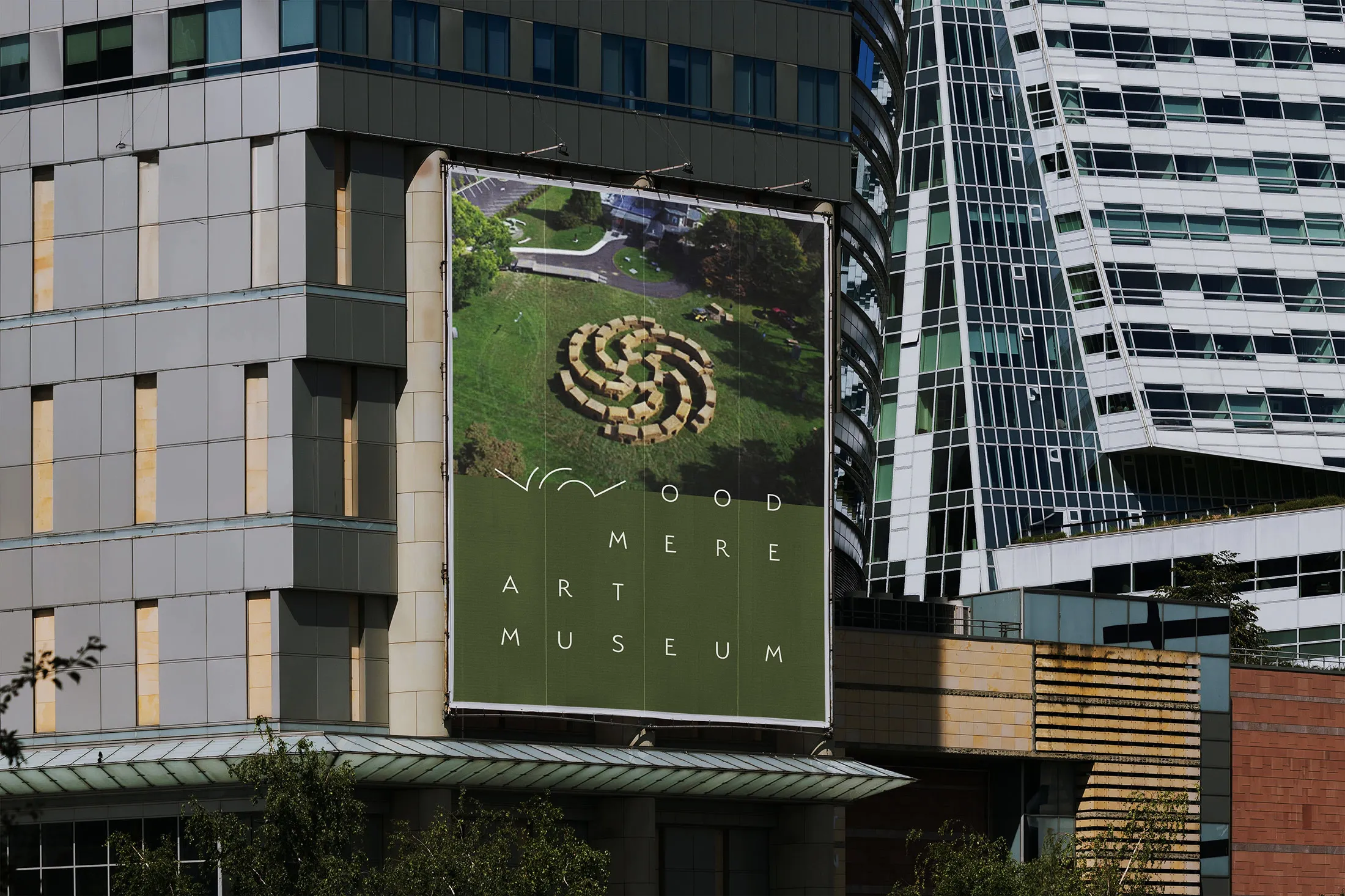
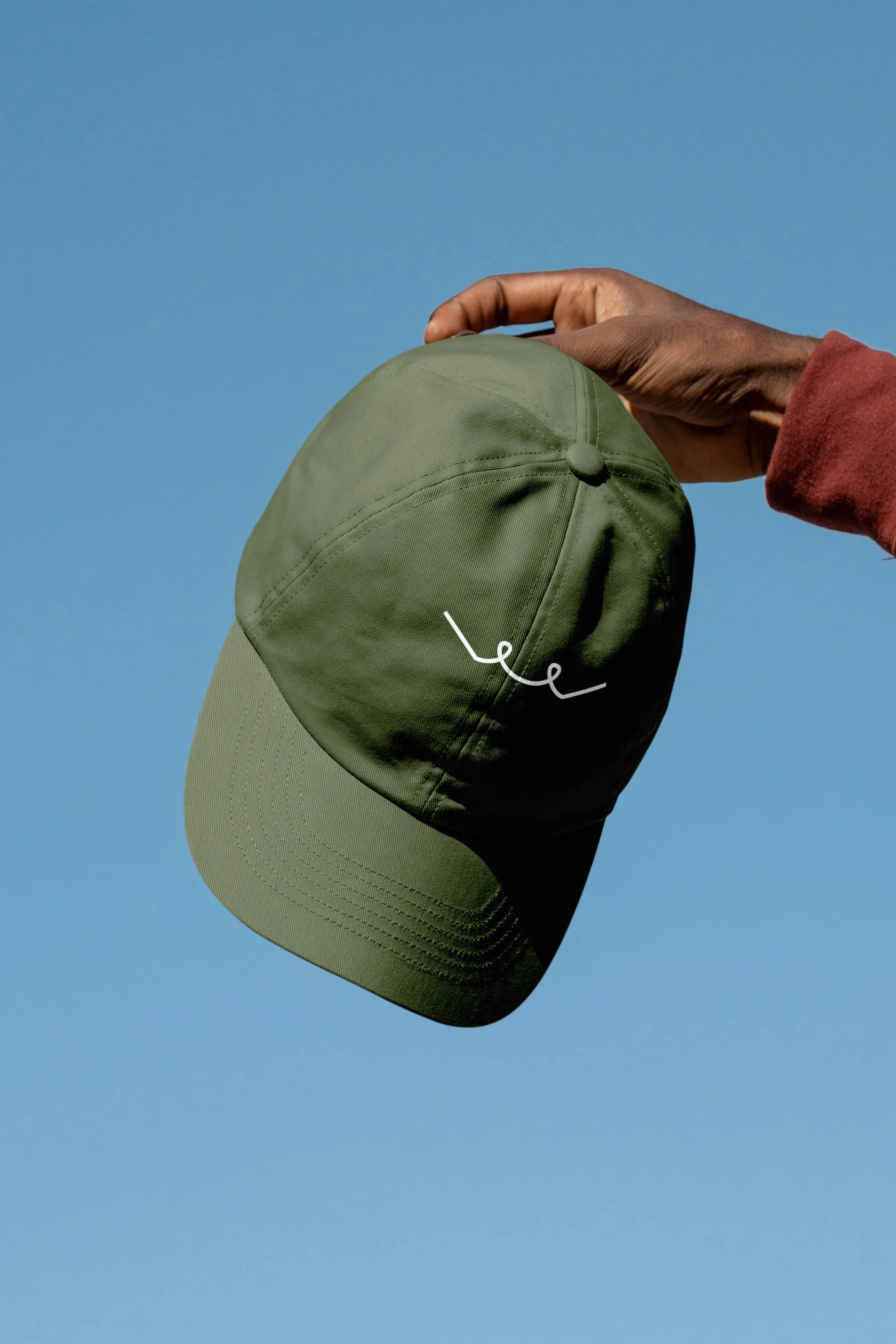
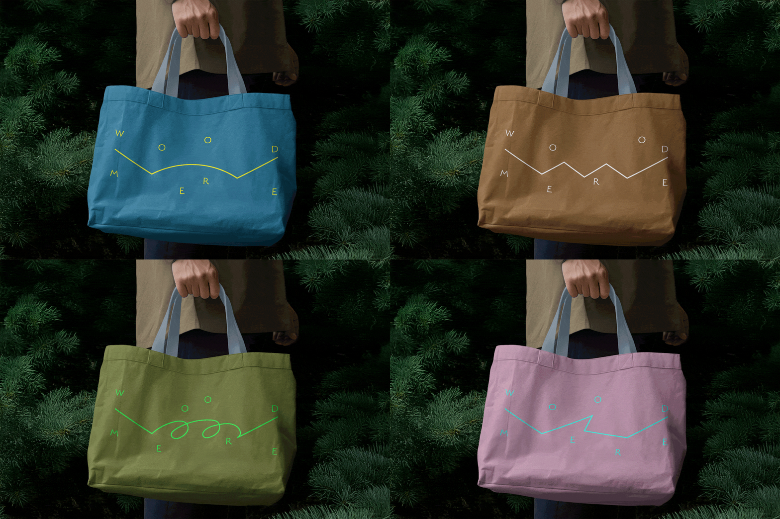
The seasonal straw maze is a unique annual attraction that helps reinforce the image of the museum as a community hub for all generations to connect with arts and nature. This unique annual image is reflected in the W mark with a shape matching that of the corresponding year, creating a collectible visual for the logo and potential season merchandise related to the maze.
The seasonal straw maze is a unique annual attraction that helps reinforce the image of the museum as a community hub for all generations to connect with arts and nature. This unique annual image is reflected in the W mark with a shape matching that of the corresponding year, creating a collectible visual for the logo and potential season merchandise related to the maze.


Imagery
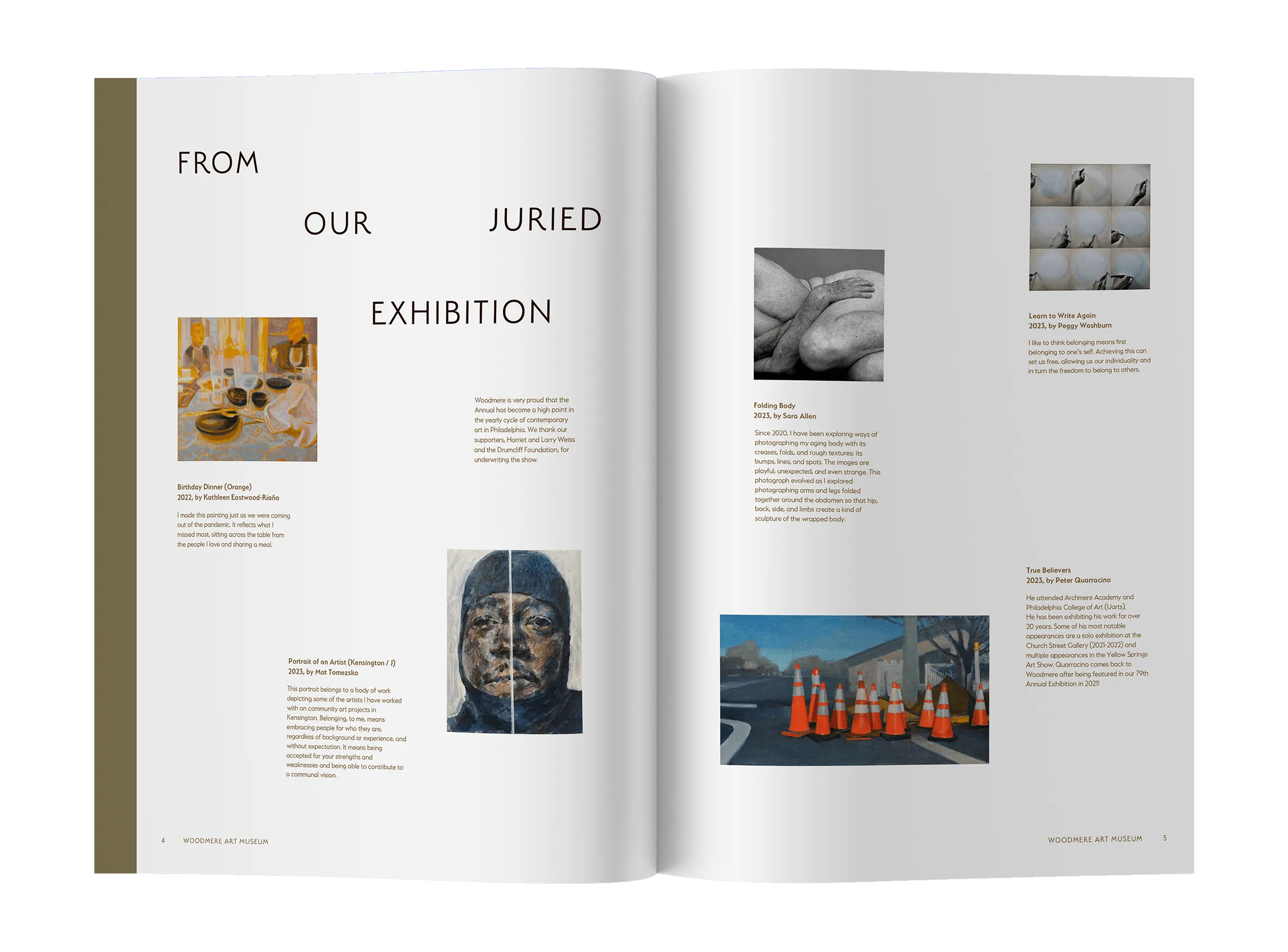
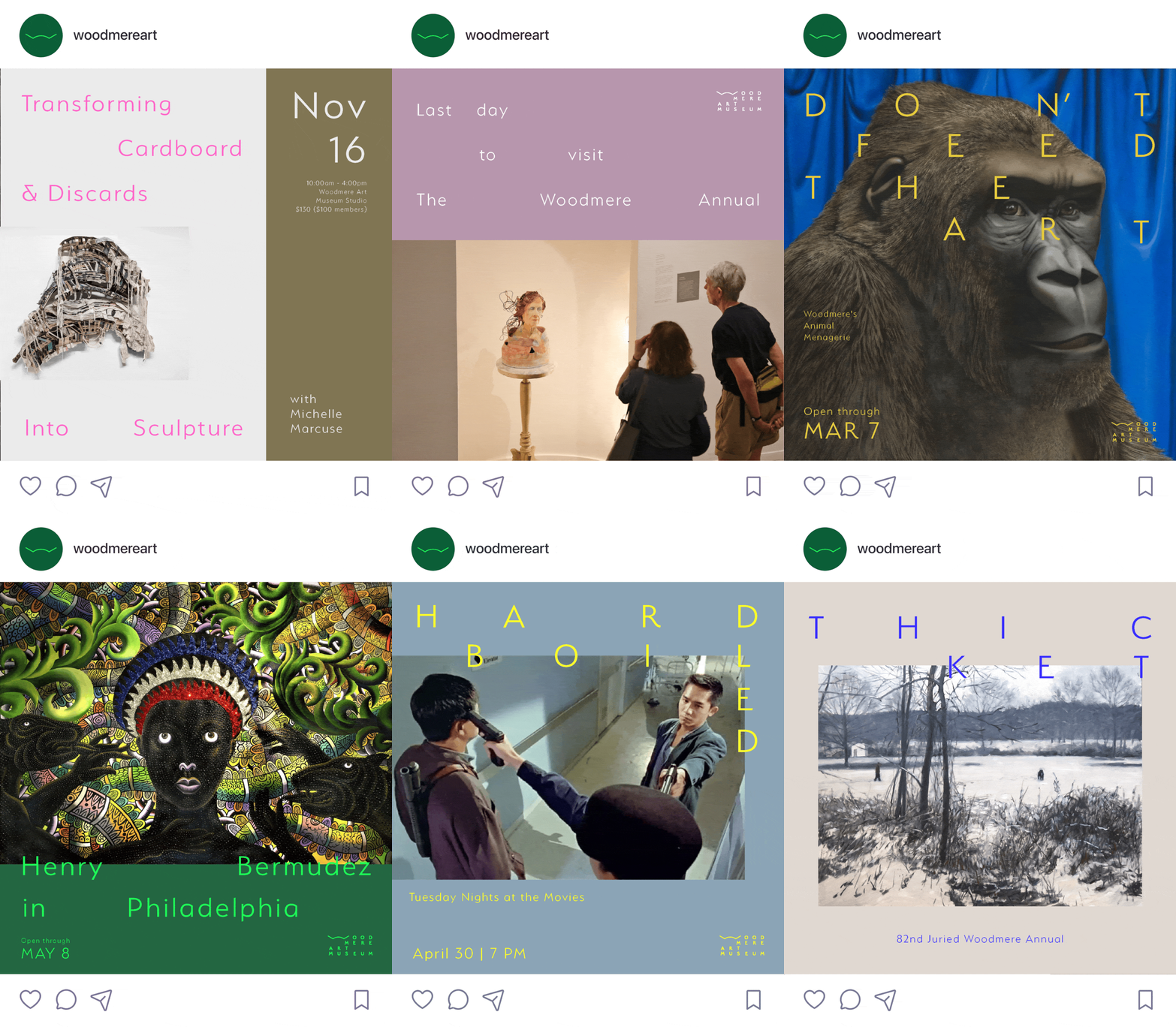
Woodmere is positioned not as a fancy institution with polished photos, but as a casual community hub with down-to-earth pictures. This approach drives their social media, using casual, daily, and natural photos alongside clean, simple artwork images, all tied back to the system via typography.
Woodmere is positioned not as a fancy institution with polished photos, but as a casual community hub with down-to-earth pictures. This approach drives their social media, using casual, daily, and natural photos alongside clean, simple artwork images, all tied back to the system via typography.

SELECTED WORK