Perspective
Brand Identity + Motion
*/About/*
Perspective Magazine is a curated platform for the inquisitive mind, offering a deep dive into social issues through the diverse lenses of the liberal arts (literature, history, philosophy, sociology, psychology, creative arts, and more). This magazine emphasizes freedom of speech, liberal topics, and perspective-shifting content. It challenges conventional thinking and encourages readers to see the world anew.
*/Vision/*
To open the eyes of humanity.
*/The Identity/*
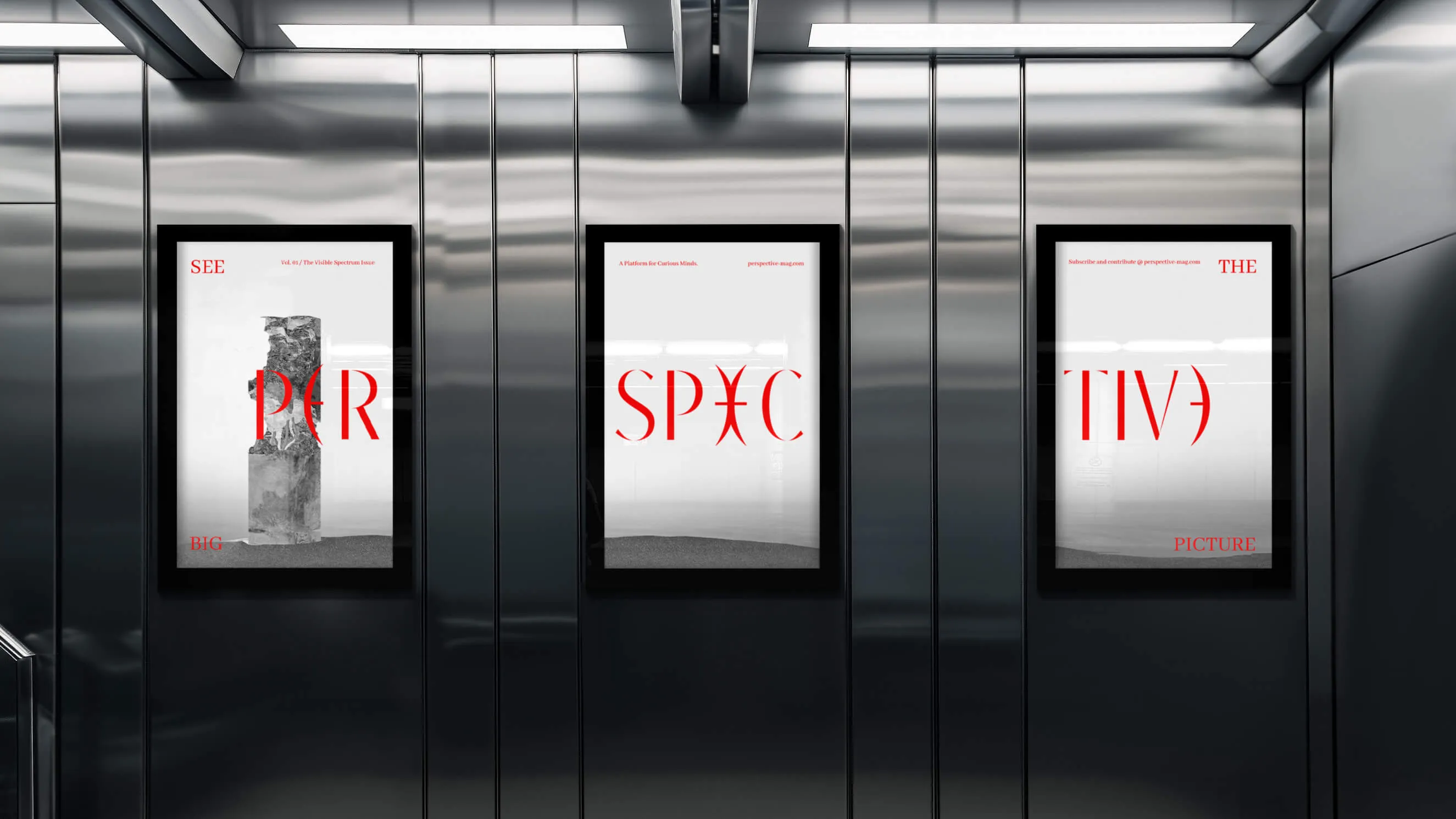
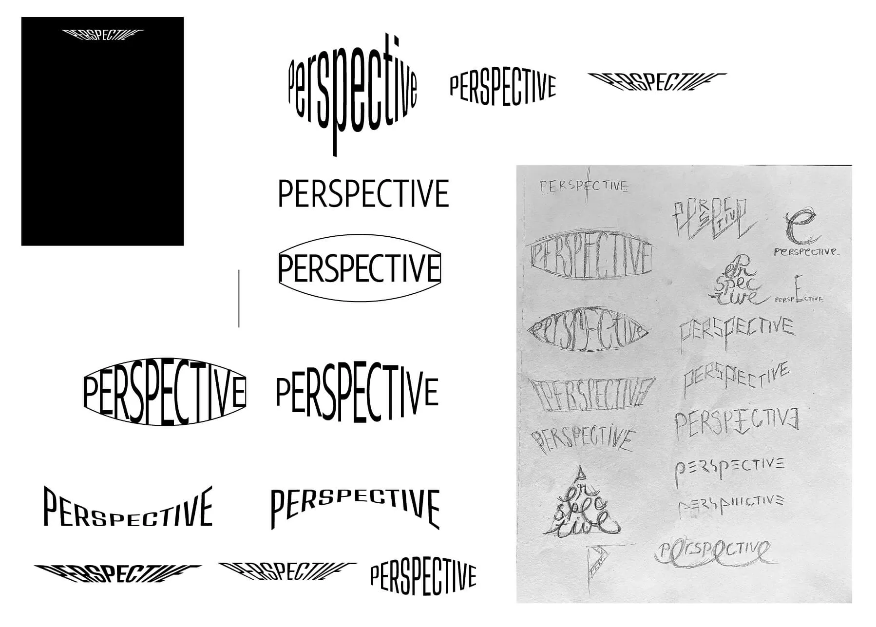
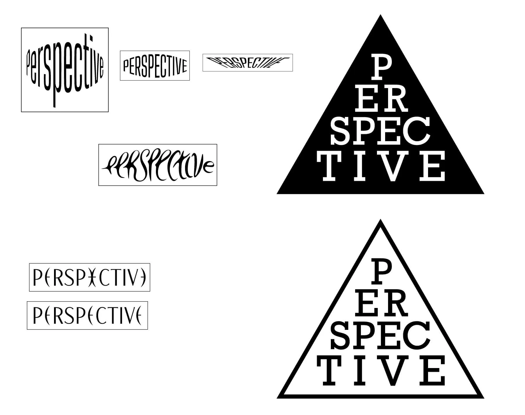
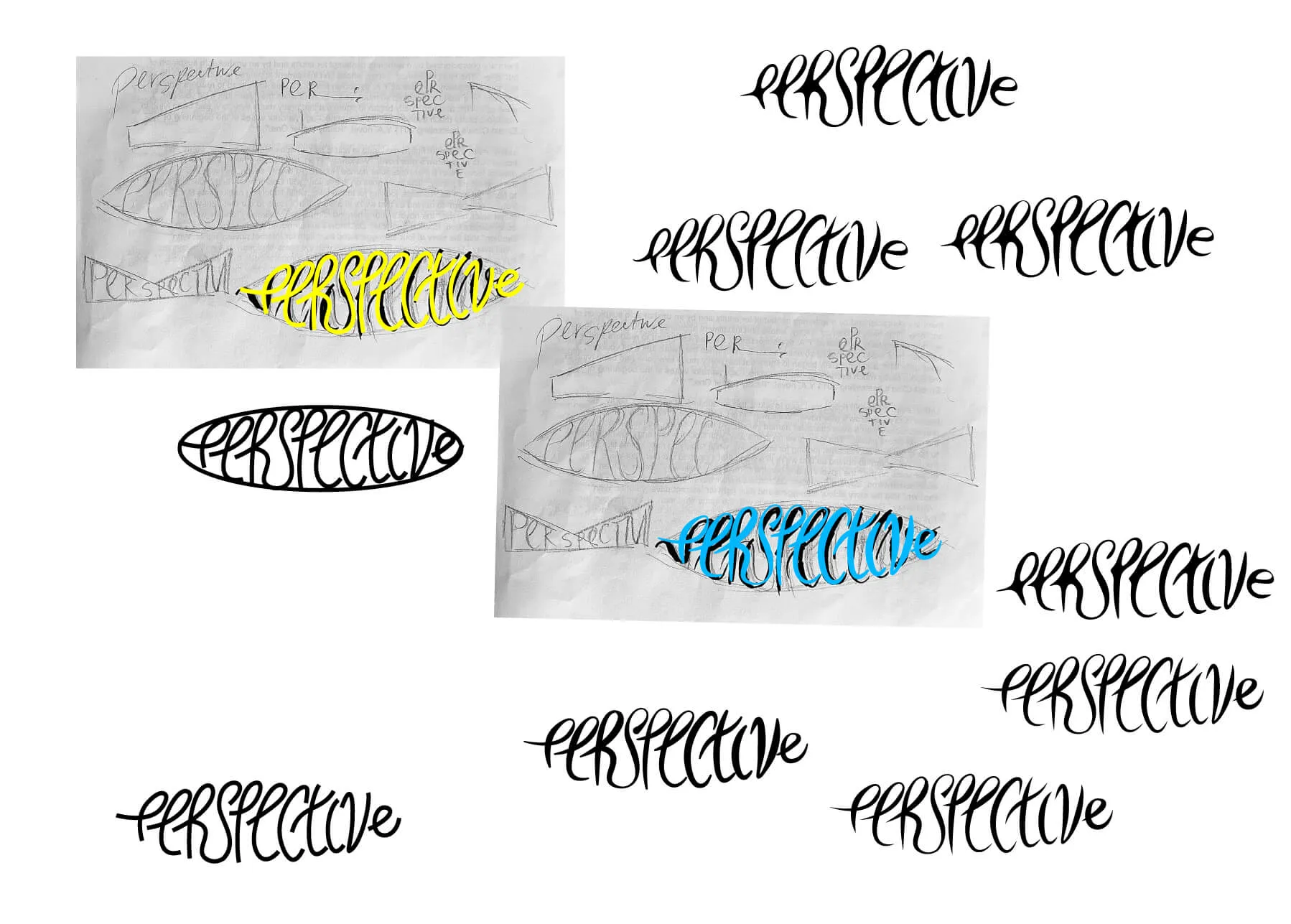
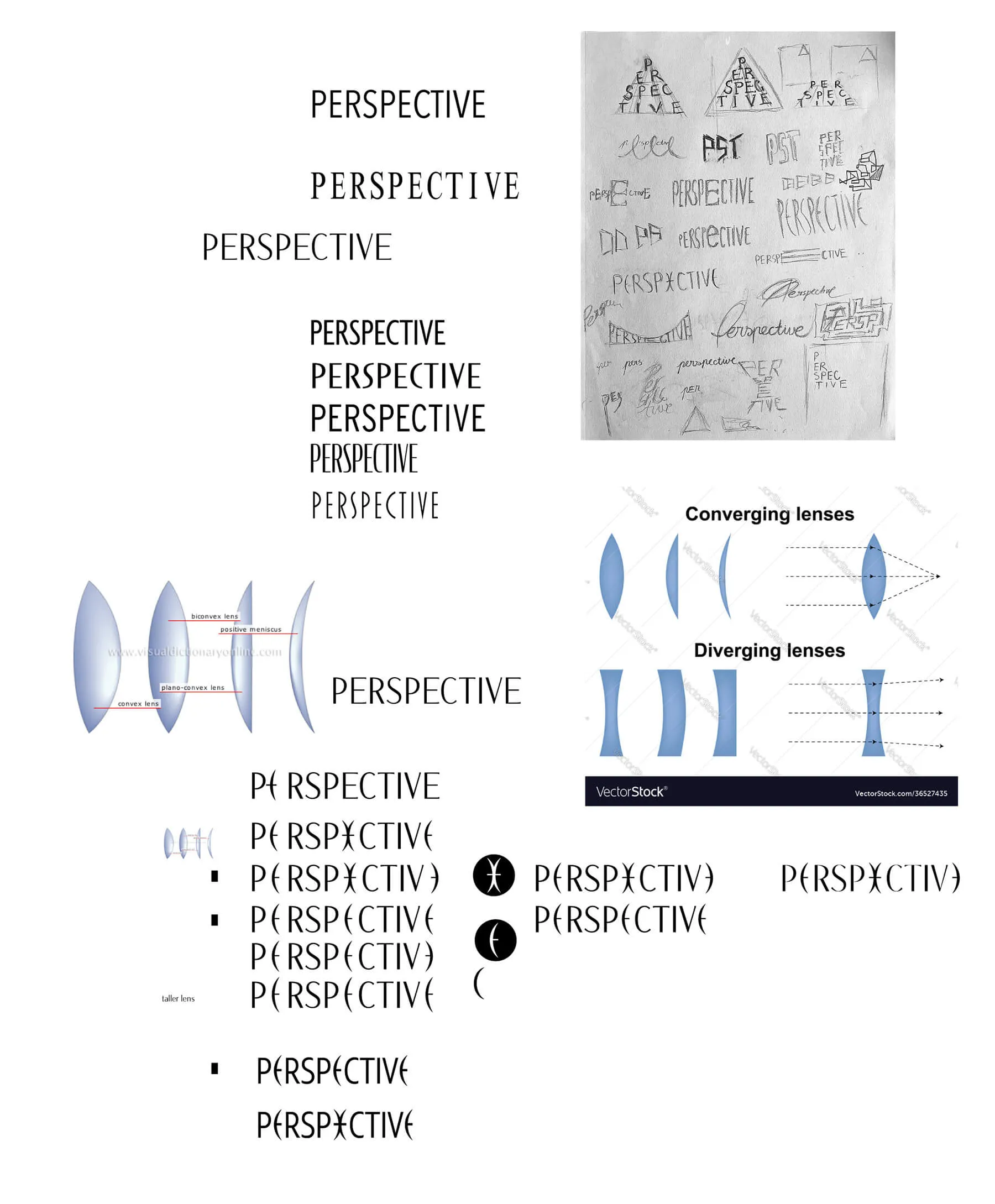
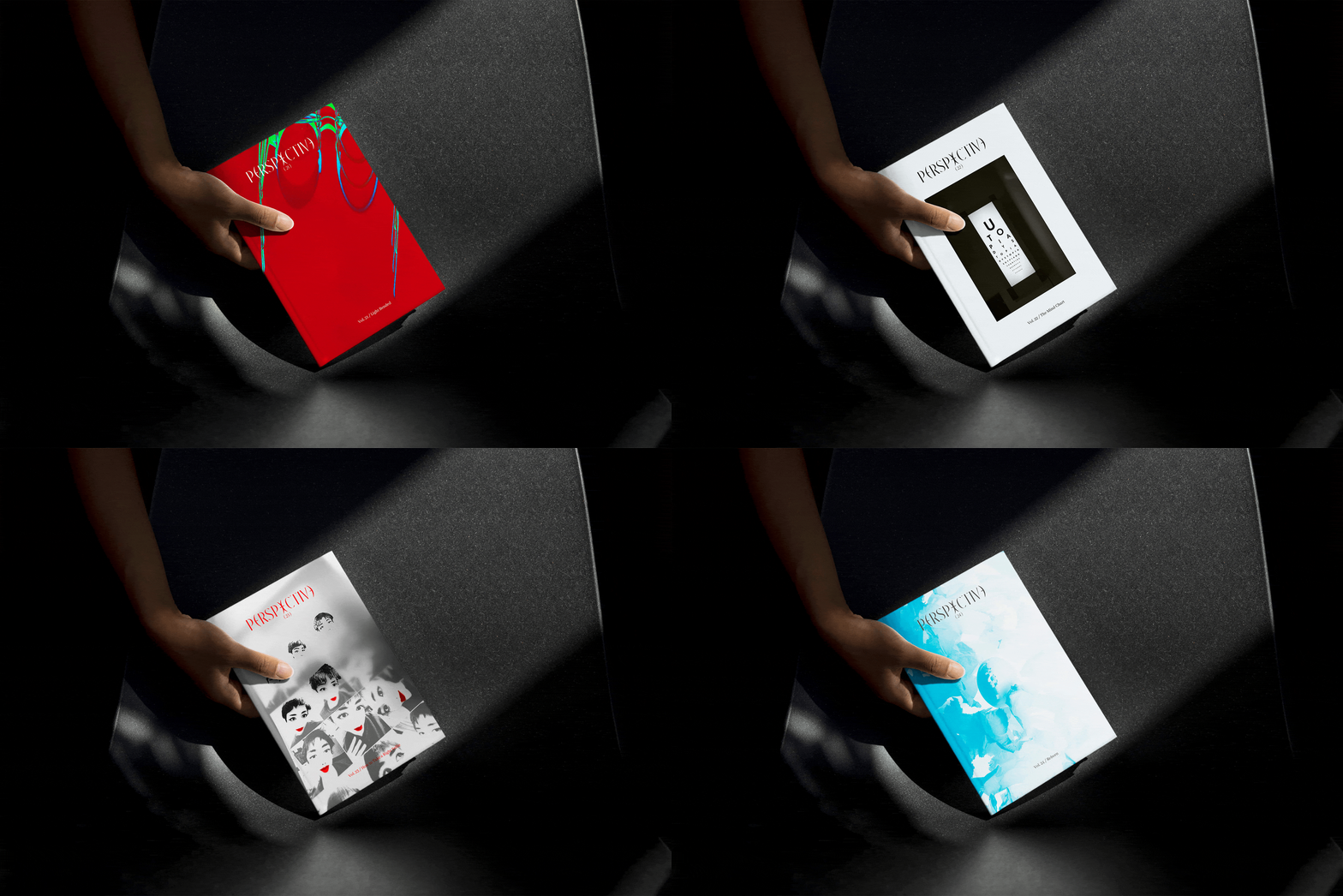
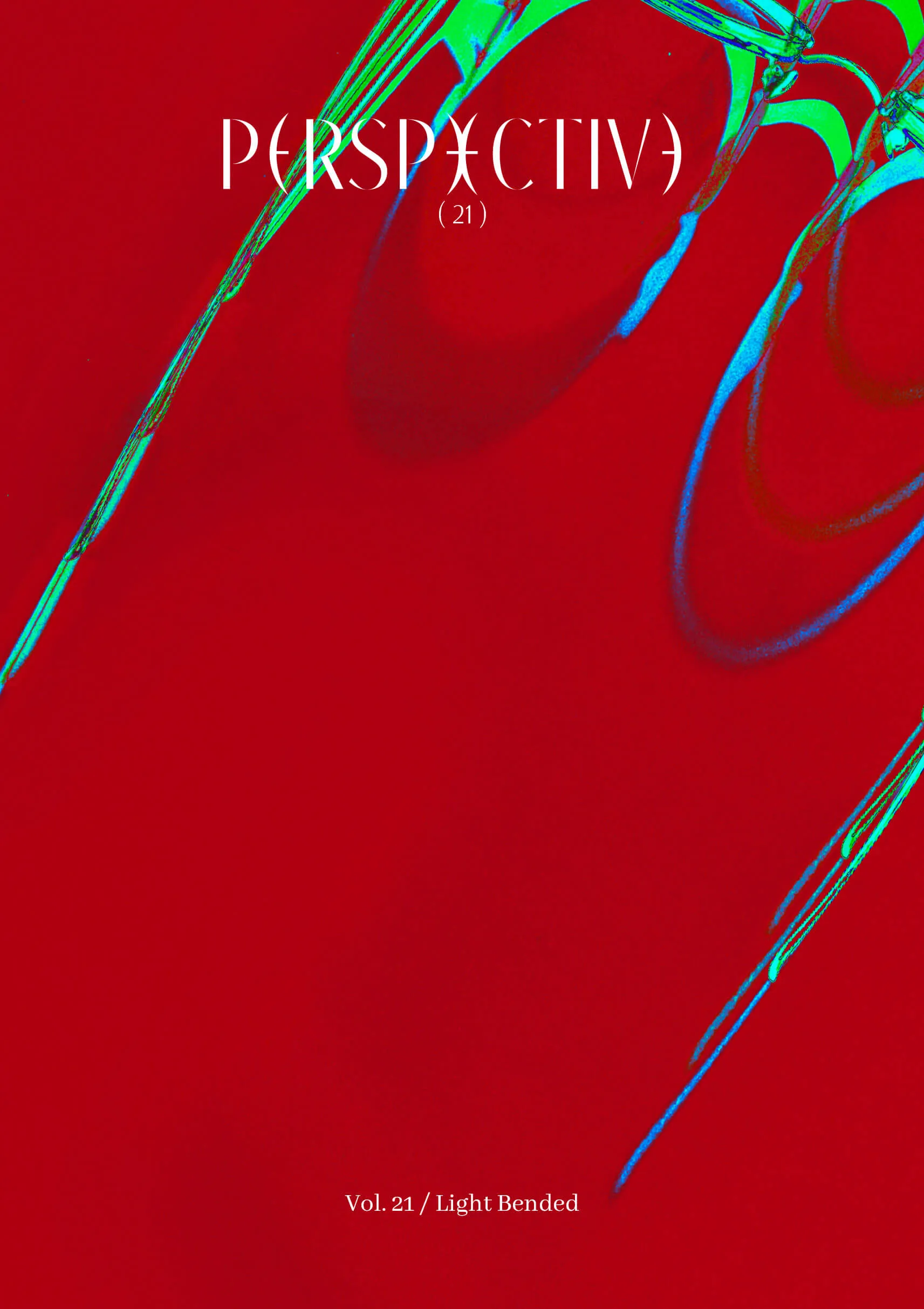
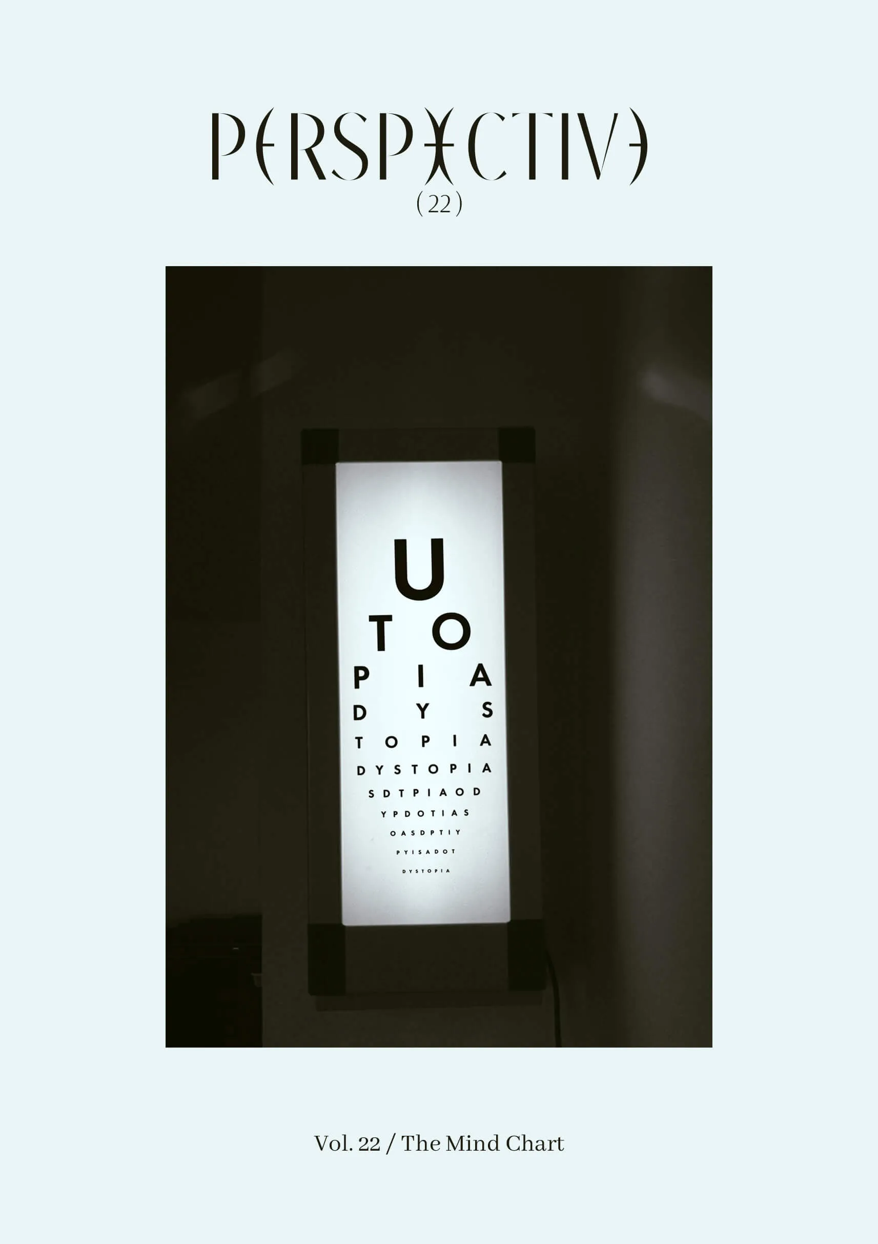
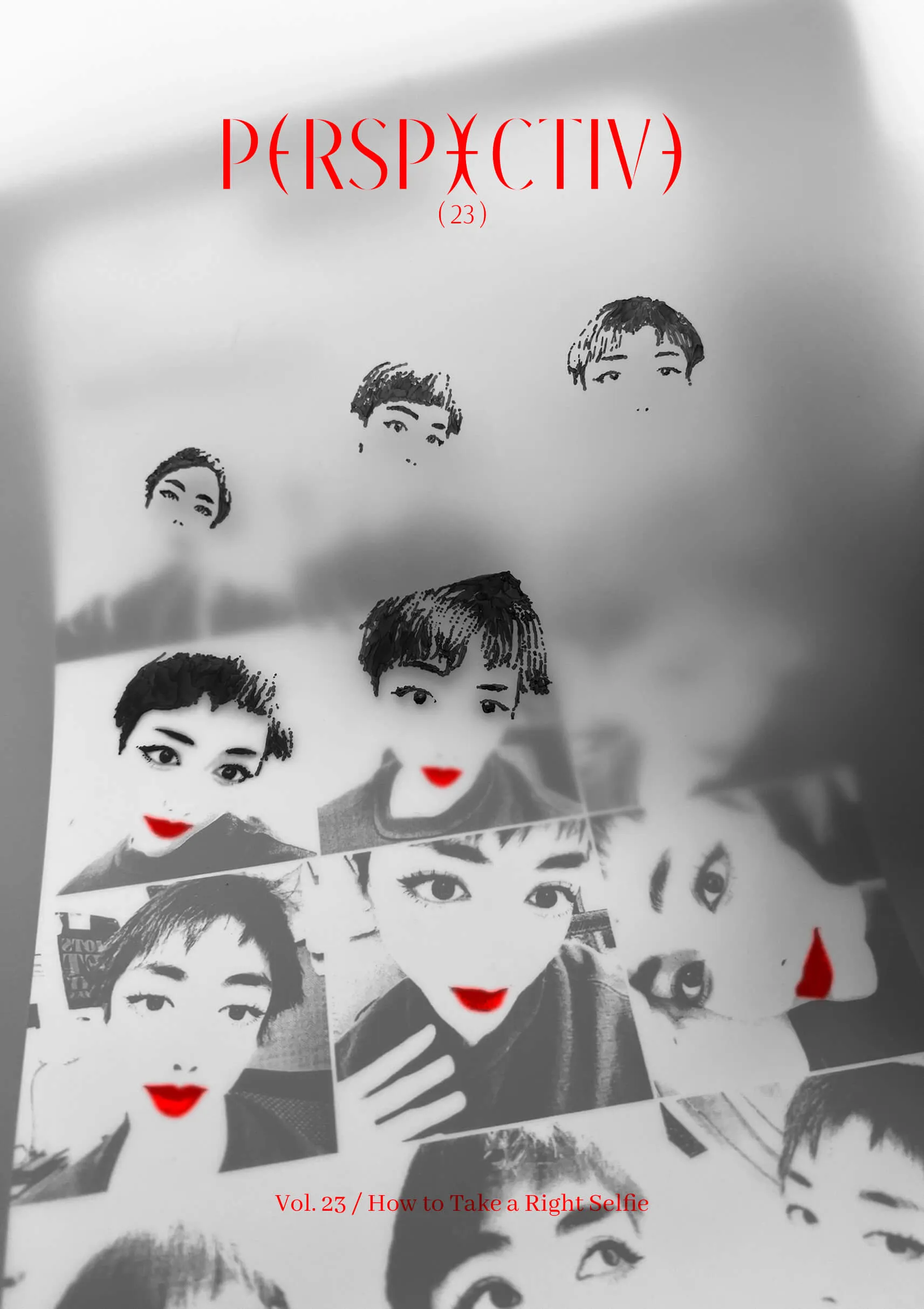
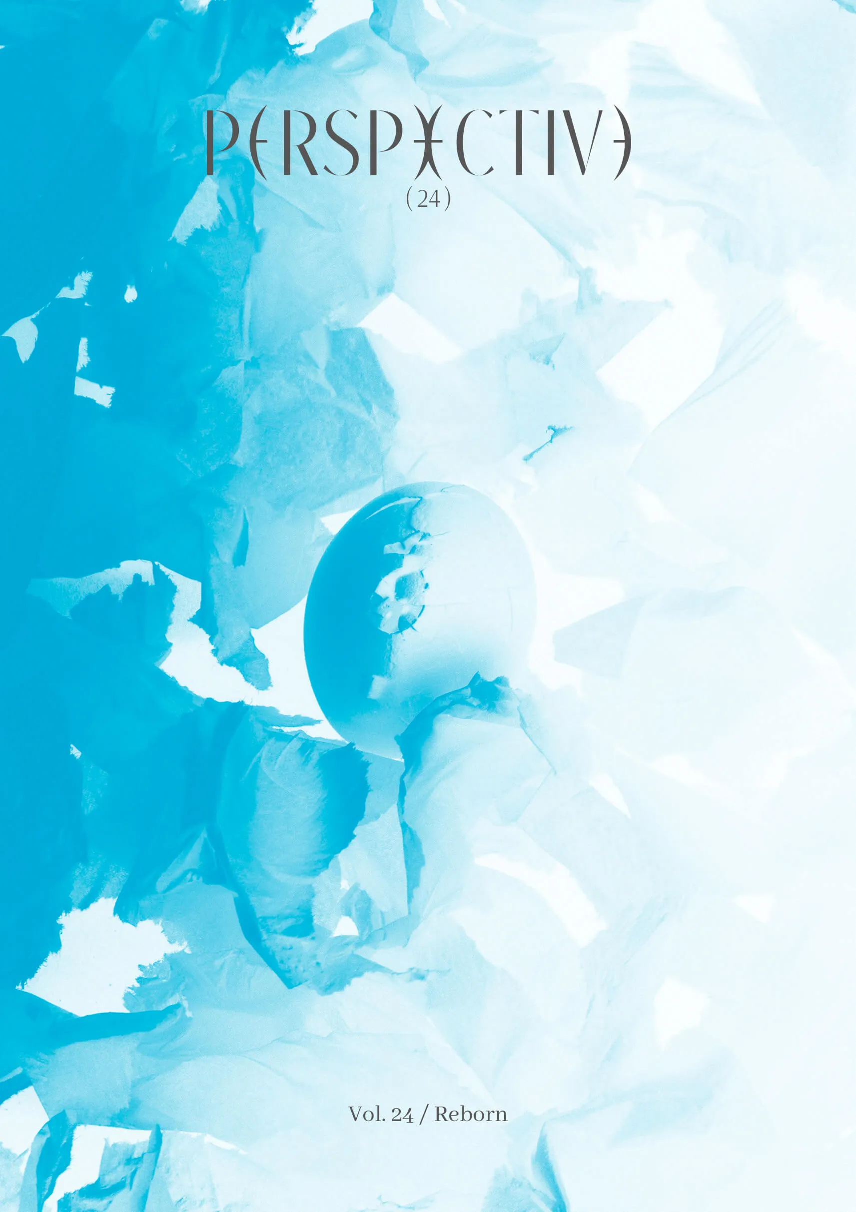
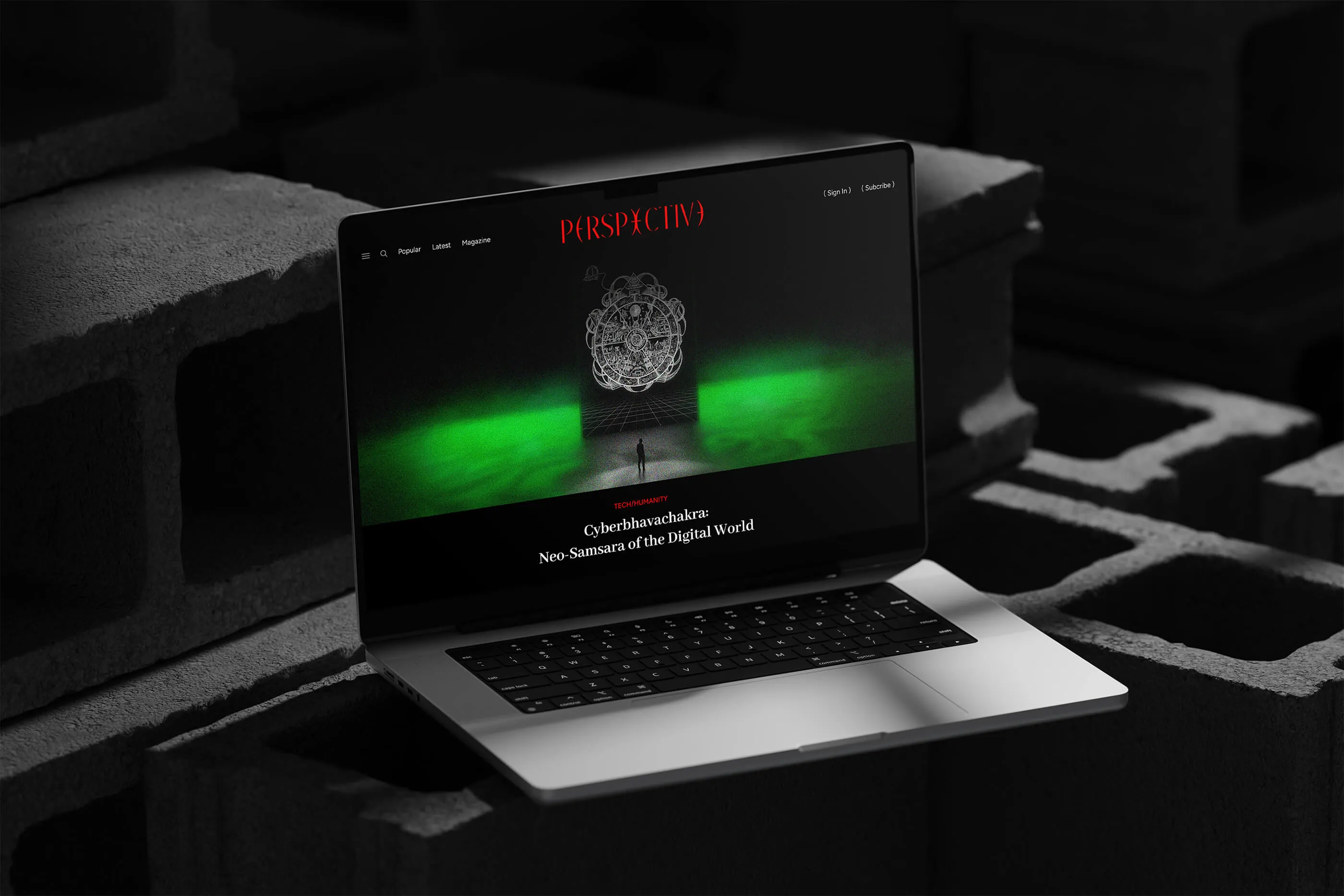
Light through a lens, truth through Perspective. The visual identity is anchored by a masthead inspired by the convex lens, symbolizing a commitment to magnifying hidden truths and illuminating the intricate layers of our society. Additionally, the imagery used in the platform is curated to be tricky, mind-bending, and thought-provoking. Together, the graphics and imagery form an intricate system that invites readers to think twice.
Perspective Magazine is a curated platform for the inquisitive mind, offering a deep dive into social issues through the diverse lenses of the liberal arts (literature, history, philosophy, sociology, psychology, creative arts, and more). This magazine emphasizes freedom of speech, liberal topics, and perspective-shifting content. It challenges conventional thinking and encourages readers to see the world anew.
*/Vision/*
To open the eyes of humanity.
*/The Identity/*
Light through a lens, truth through Perspective. The visual identity is anchored by a masthead inspired by the convex lens, symbolizing a commitment to magnifying hidden truths and illuminating the intricate layers of our society. Additionally, the imagery used in the platform is curated to be tricky, mind-bending, and thought-provoking. Together, the graphics and imagery form an intricate system that invites readers to think twice.
INSPO + EXPLORATION
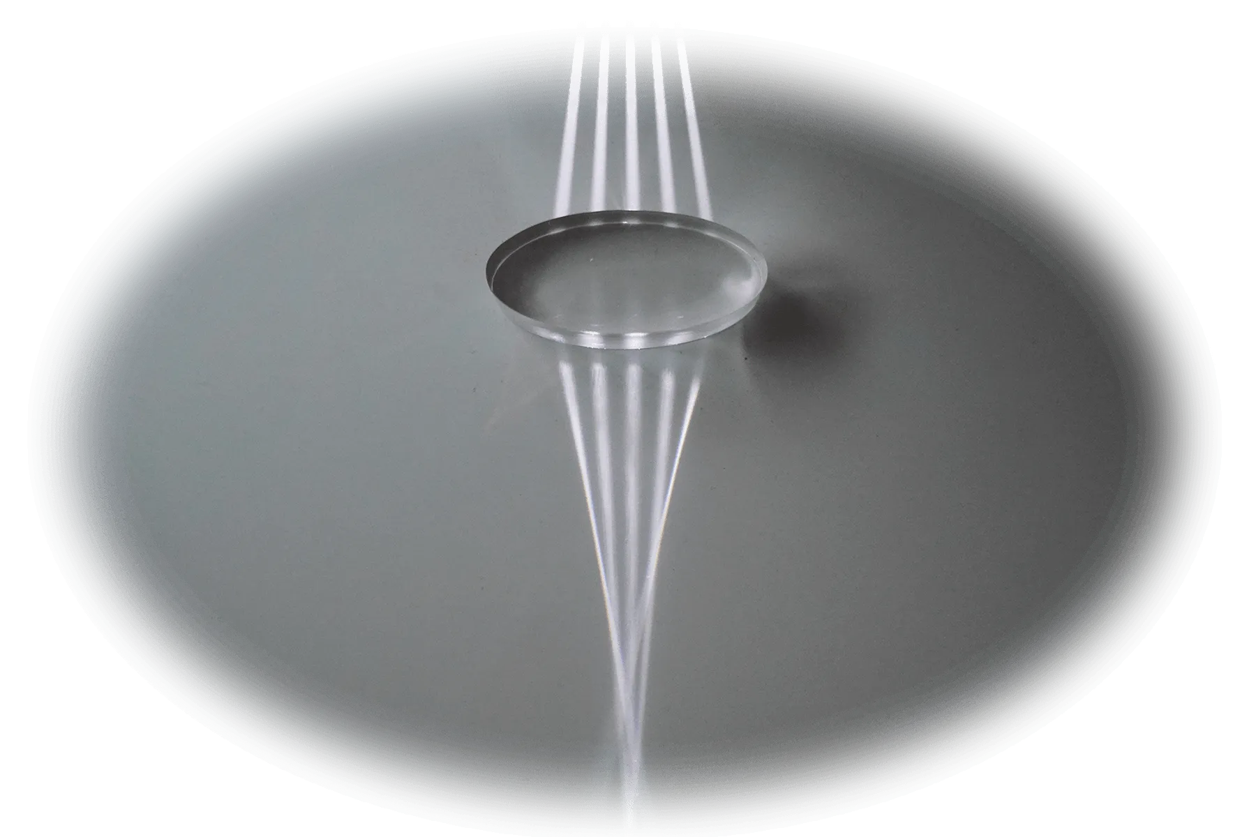
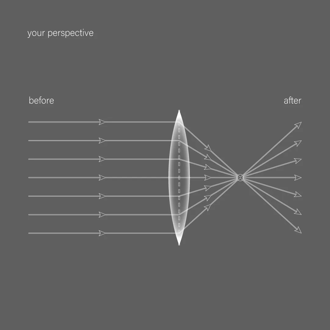
Inspired by the multifaceted nature of perspective, I explored the theme of light and lenses—how light shifts through a lens and how humans observe this phenomenon. Perspective Magazine, much like a convex lens, refracts and magnifies our understanding of the world.
Inspired by the multifaceted nature of perspective, I explored the theme of light and lenses—how light shifts through a lens and how humans observe this phenomenon. Perspective Magazine, much like a convex lens, refracts and magnifies our understanding of the world.

MOTION & COLOR
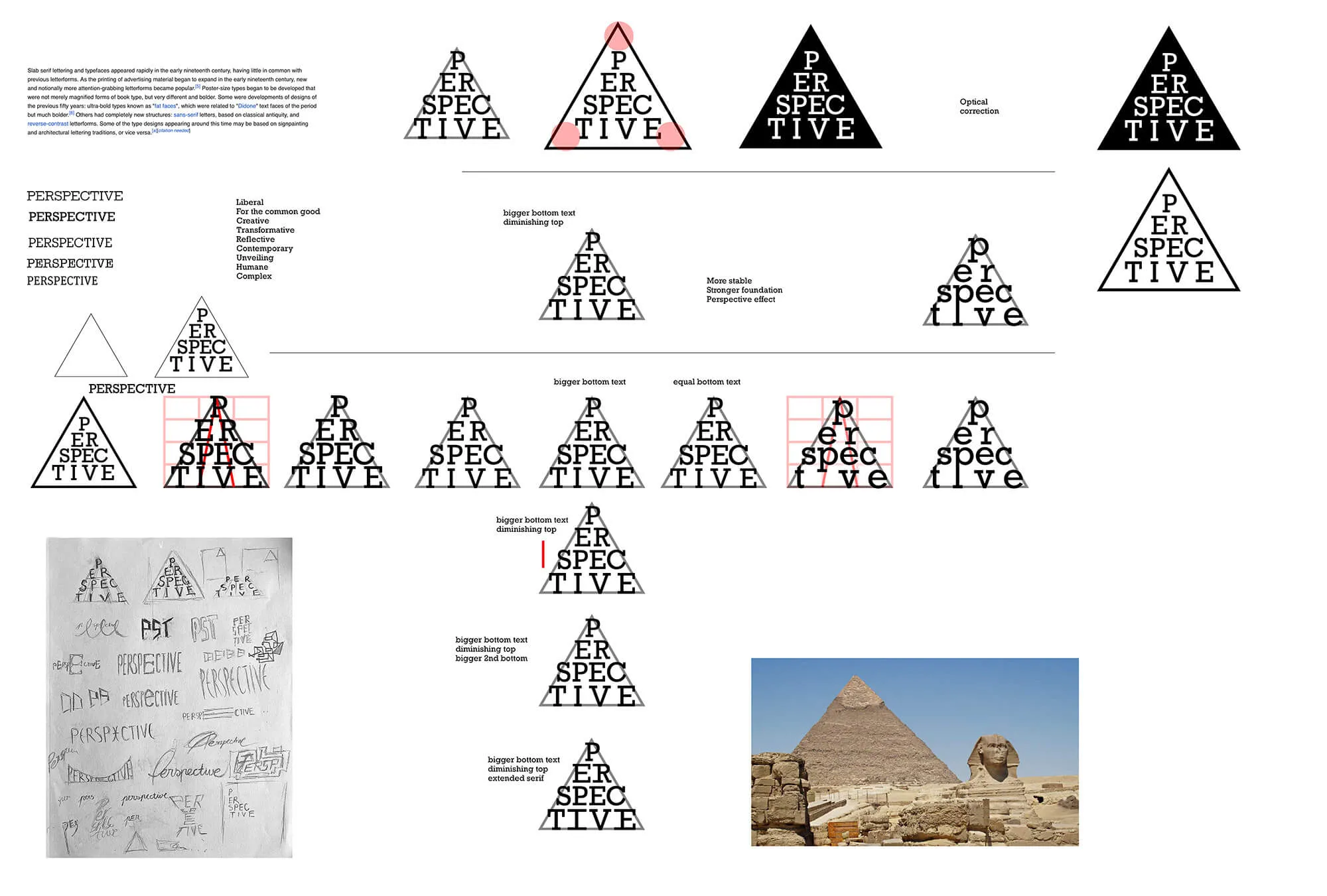
Motion is integrated to deepen reader interaction. The logo dynamically "flips" and "unfolds," symbolizing the shifting of perspectives and the unveiling of new ideas. This motif is extended across all imagery, video content, and online interactions.
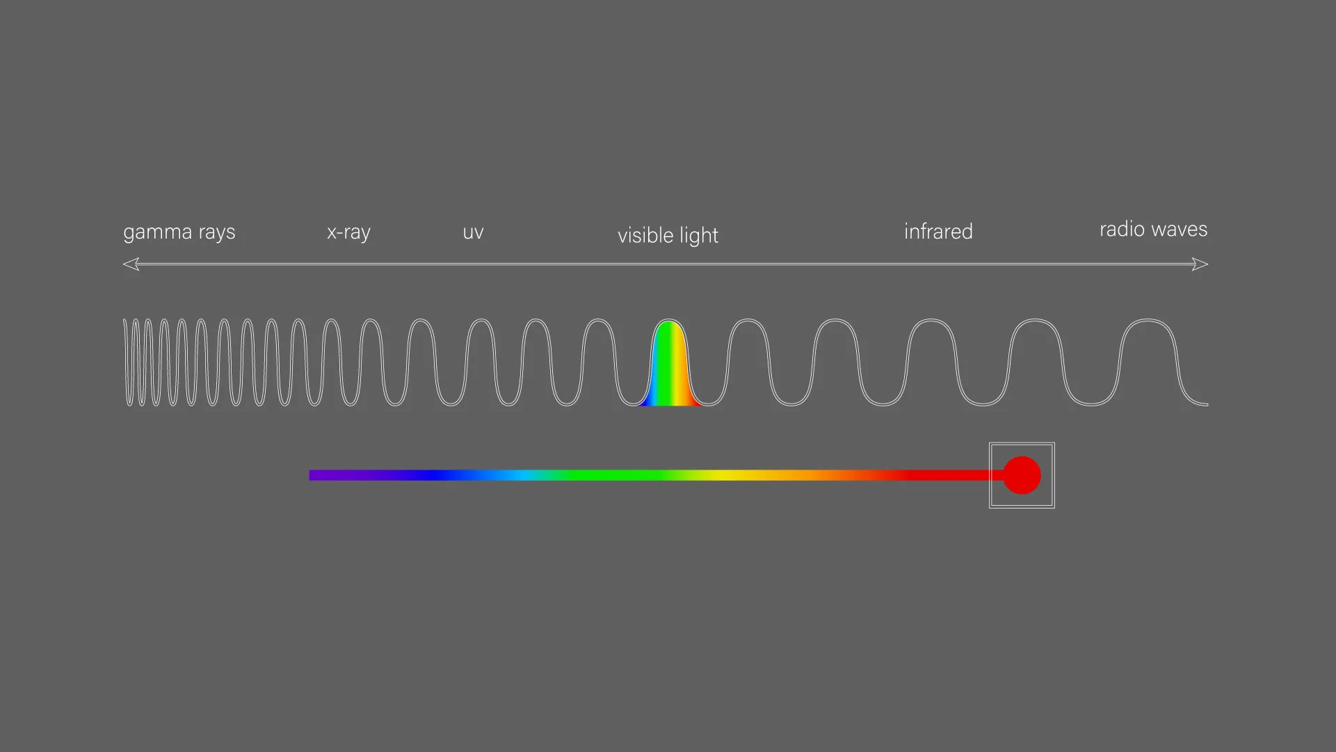
The primary color is red, extracted from the spectrum of visible light. Red lies between the visible and the invisible, embodying the magazine's role as a bridge between the surface and the depths of understanding.
Motion is integrated to deepen reader interaction. The logo dynamically "flips" and "unfolds," symbolizing the shifting of perspectives and the unveiling of new ideas. This motif is extended across all imagery, video content, and online interactions.
The primary color is red, extracted from the spectrum of visible light. Red lies between the visible and the invisible, embodying the magazine's role as a bridge between the surface and the depths of understanding.
SELECTED WORK